
Guusto
Website
Guusto is a Vancouver-based B2B SaaS startup with a mission to help build a culture of recognition and boost customer loyalty through their rewards and recognition platform. With Guusto, HR leaders, managers, colleagues, and business owners can express real-time appreciation to employees and customers through giving monetary rewards via digital gift cards and non-monetary nominations. Guusto strives to be the modern solution to existing recognition programs by relieving administrative work involved in using physical gift cards.
My role as the sole Product Designer and Web Developer Intern is to help better deliver their vision via the marketing website and improve the product experience. This case study will only cover the marketing website. To see product design work, click here.
Type
Internship
Role
Web Design, Front-End Web Development, Figma, Product Design
Tools
HTML/CSS/Javascript, Bootstrap, Illustrator, Photoshop
Duration
Sept 2019 - August 2020
The Marketing Website
The marketing website is the launchpad into learning all about the product, entering the platform, and making the most out of the platform through resources on building a culture of recognition. I was tasked with revamping this important nexus between Guusto and customers. With HTML, CSS, Javascript, and Bootstrap, I updated existing webpages and created many new ones.
Content First
For existing pages, my goal was to first identify any gaps in messaging then focus on usability. From watching demo videos and attending sales calls, it not only helped me gain a better understanding of the platform, but realize that there was a large emphasis on employee recognition, creating rewards programs, and how it is more effective than current rewards programs that are labour and time intensive. The old website, however, communicates the ability to send gifts but lacks context of what Guusto was selling, its positioning, and the value it brings. Customer confusion around what Guusto is reinforced this. With the new homepage, it now reveals Guusto's offering as more than simply gifting. I wanted to add a new introductory section to fill this information gap with an accompanying product image, right below the hero banner. As well, I wanted the language in the hero banner to be more explicit on the intention behind the gifting. Here and across the site, my manager, Skai Dalziel, and his co-founder have been ever-refining the content across the site.
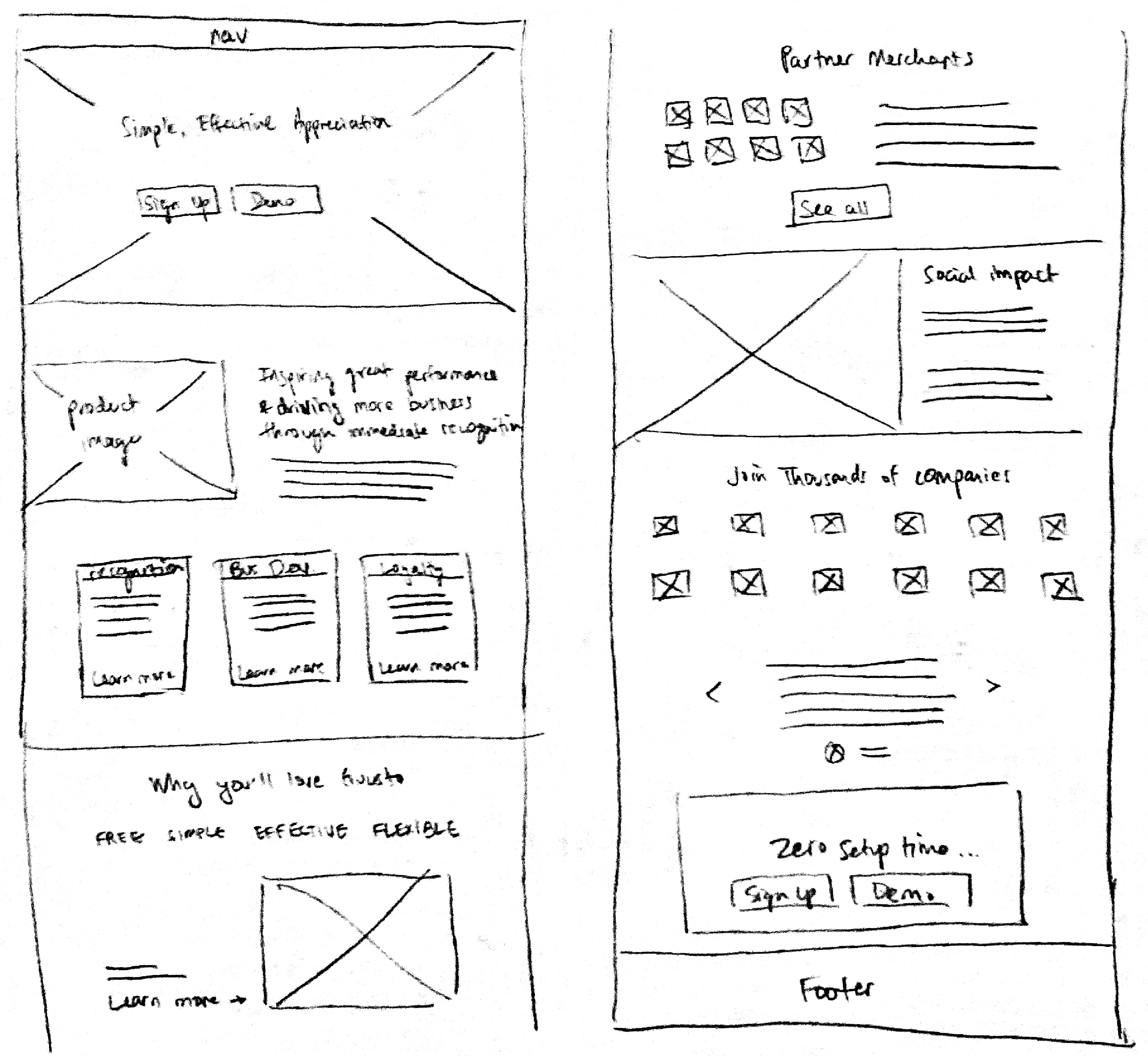
With regards to improving usability, I noted multiple uses of buttons which can create confusion around the main call-to-action, I restyled the “Why you’ll love Guusto” section as text alone can make it lost within the page, and I created carousels to afford more client logos and testimonials to help add to Guusto’s credibility.
Improving Navigation
Other areas for improvement was the presentation of information on the How it Works page and each solution page, i.e. Employee Recognition page. The information was lengthy and, specific to the How it Works page, inconsistently formatted, making navigation difficult which can impact bounce rates.
For the How it Works page, I created a consistent layout of text on one side with supporting visual material next to it and added a sub navigation to better support readability.
For the solution pages, I turned the many features of the Guusto platform into clickable cards such that the information is more digestible at a glance yet affords the ability for users to learn more. Ultimately, these changes will help Guusto retain website visitors.
Increasing Discoverability
Lastly for webpage updates, I wanted one place to house all customer stories, including case studies and testimonials to make it more more intuitive to find and not embedded in other pages. While testimonials still remain on pages for its relevancy, I wanted to direct visitors to one place where they can learn more from other customers. The new Customer Stories page now consolidates case studies, testimonials, as well as reviews from Capterra, a business software review site, to provide visitors greater social proof.
Scaling Up
I also created many new pages, including the About, Careers, ROI Calculator, and multiple landing pages for capturing resource sign ups, showcasing at a HR conference, and enticing new and existing customers in time for the holidays. These new pages were created to support Guusto’s continuing growth as a business, enhance their marketing efforts in attracting new clients, as well as showcase their impact and expertise.
A notable project is the ROI Calculator. The ROI calculator was initially given to customers in an Excel sheet, a touchpoint that can look convoluted especially to those who do not have a confident understanding of finance or Excel. As well, as it was intended for potential customers to download and plug in numbers on their own, it can be difficult for the sales team to speak to those numbers, missing an opportunity to gain customer buy-in. I was tasked with turning the ROI Calculator into a simplified webpage for easy sharing. My manager helped identified which variables were most important as input and explained how the calculations work. I explored different interface designs and settled on a layout where changes input revealed changes in output contained in a sticky, always-visible container.
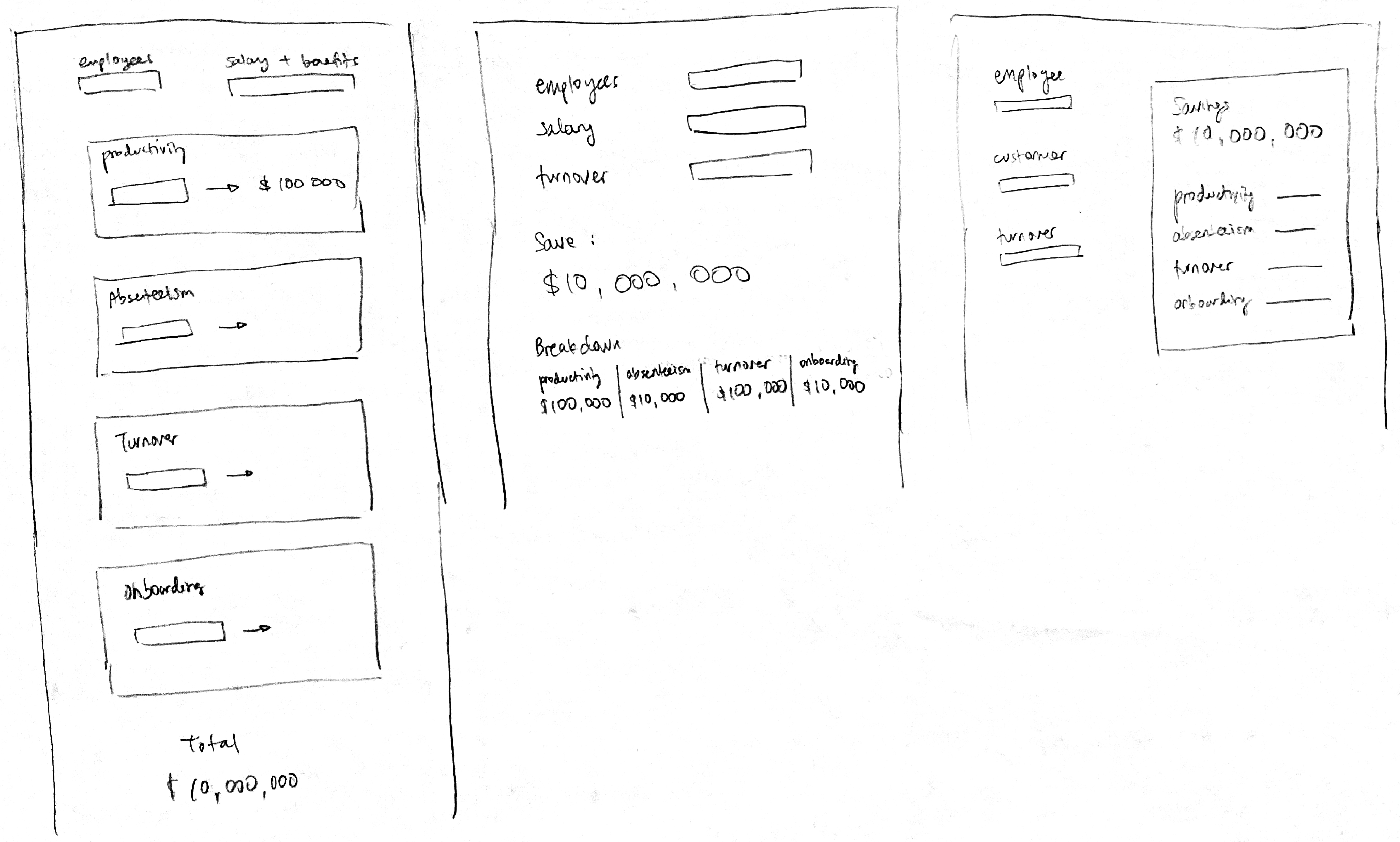
This ensures users will see an immediate connection between what is entered and the resulting ROI. Furthermore, I added an odometer-like animation to allow the human eye enough time to catch value changes as well as help users grasp how output increases or decreases depending changes to input. Initially, all input variables were visible. After iterating, the ROI calculator now considers audiences who are not numbers-oriented with only the essential input variables, while for other curious and number-savvy users, more input variables are offered as well.
Results
While some pages were not as effective in achieving desired results, i.e. receiving a lower than expected number of video sign-ups, it was interesting to see the co-founders’ pivot in strategy to remove the new customer sign-up form and make the video more readily accessible for greater customer buy-in. This was a learning for me to look beyond the user experience and sales numbers to marketing results as this can also impact design decisions. Meanwhile, for other website changes, my manager informs me that customers are seeing greater product clarity and showing more interest in Guusto. As well, google analytics reveals a 41% drop in bounce rate. Very happy as I am about the drastic improvement, the reduced bounce rate is a joint effort from the team of sales, marketing, and my managers in polishing website content, providing feedback, and passing the website along to clients.
Reflection
Working within a start-up has taught me to be highly attuned to many moving pieces, internally at Guusto and externally. Design to me is to provide value to end users and businesses, but realized from my time at Guusto that there was more to increasing sales. Website analytics factored into design decisions, informing of what other pages were equally as important as the homepage. Also, seeing form submission results can also shift priorities on gathering data at all. As well, end users weren’t the only ones I had to design for as the ROI calculator was also a tool for the Sales team. Beyond our immediate responsibilities, I also learned that customer optics is infinitely important, and especially so in the employee recognition/HR space. Gathering, responding, sharing, and celebrating customer feedback with the team is almost a second business alongside selling the platform. Although Guusto is a small team, being people-centric is a big driver at the company, making my experience as the empathetic designer all the more fulfilling.