Royal City Physio
Web Platform
Royal City Physio (RCP) is an independent local physiotherapy clinic that prides itself on providing high quality individualized care through manual therapy, sports rehabilitation, and acute chronic injury treatments from children to athletes.
We created a Home Exercise Program web platform that gives physiotherapists the ability to create and share ever-changing exercise routines for their patients. Our goal is to extend RCP’s quality of care from in-clinic to the post-session recovery stage.
My role in this project was mainly focused on leading the team, interviewing, journey mapping, creating participatory workshops and facilitating it with RCP, ideation, content writing, user flows, and UI design.
Team
Joshua Fan, Kristina Kim, Jason Yang
Type
Academic
Role
UX research, Ideation, Content writing and strategy, User flows, UI design
Tools
Illustrator, Figma
Duration
13 weeks
Process
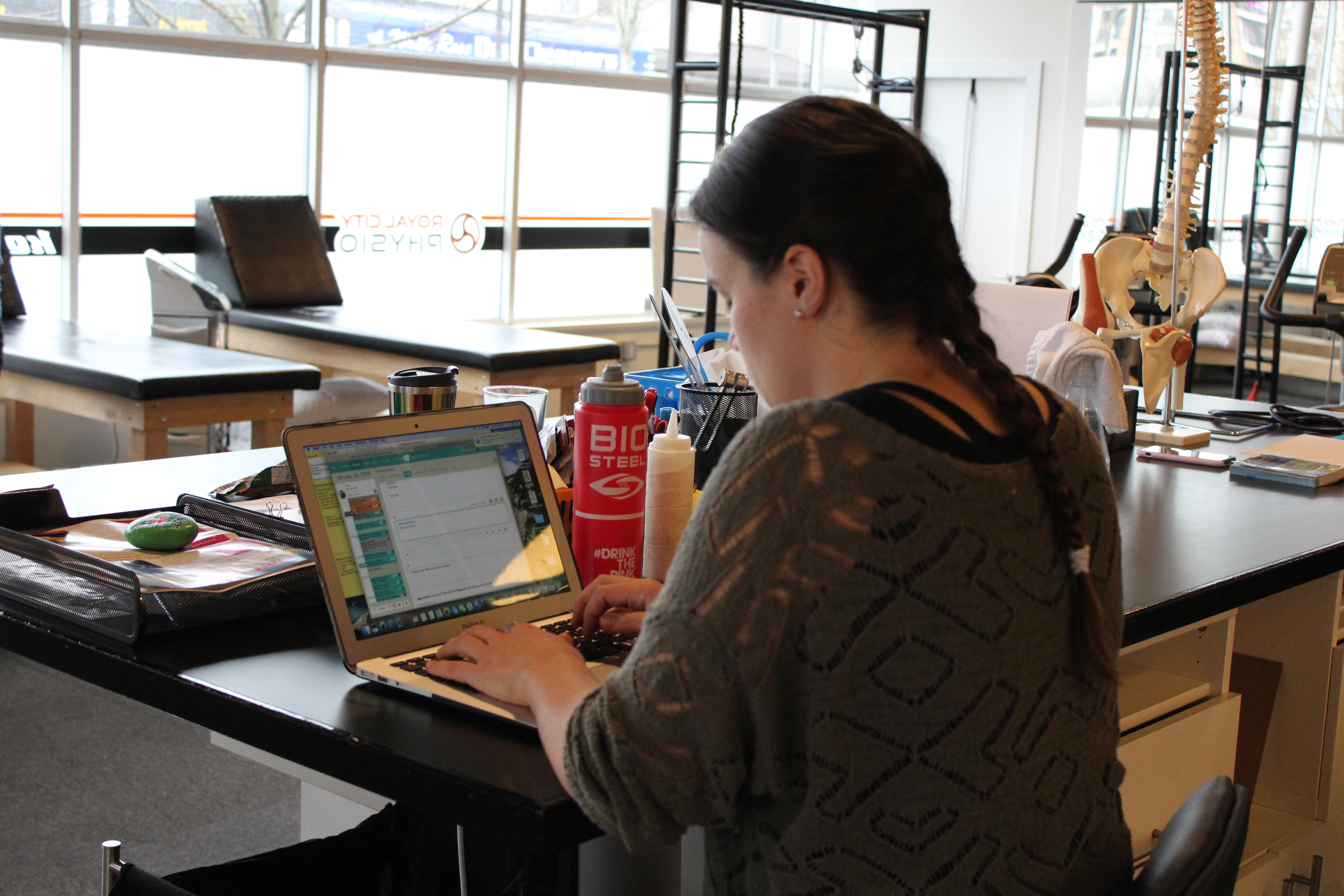
My team conducted research through two methods: an ethnography study to explore opportunities in enhancing RCP’s quality of care, and, once the opportunity was identified, a participatory workshop to gain a deeper understanding.
Ethnography: Interviews and Observations
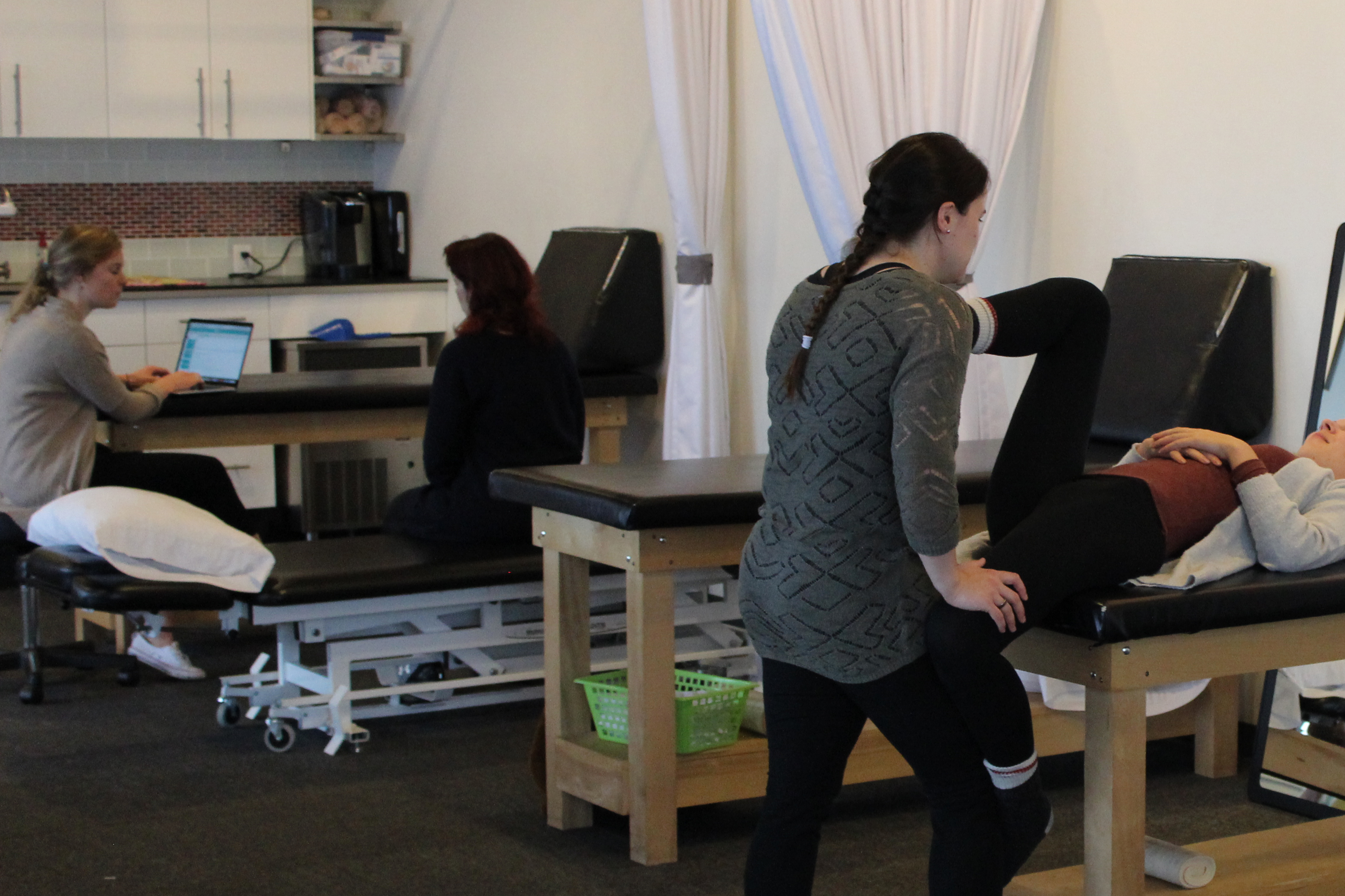
From an interview I conducted with a receptionist, we learned that patients face barriers during the onboarding phase. This includes new patients expecting private rooms instead of an open studio concept, requiring administration to explain and ease them; not realizing that they need to register their vehicle; and having frustrations around the booking system when their appointment is not successfully booked. The problem is particularly more apparent when the waiting area becomes busy and office administration are unable to give their usual verbal welcome and instructions.
From an interview with a physiotherapist, we learned that when physiotherapists teach patients about their condition and provide exercises, this knowledge does not always get across to patients, either due to jargon, difficulty in visualizing, or comprehension. A potential cause of this problem is that physiotherapists prescribe exercises different ways, such as verbally, in handwriting, or through drawn pictures or photos. This results patients being uncertain of what to do, skipping their recovery program until the next time.
“Most patients won’t send me an email saying ‘Hey, I don’t know what I’m doing’. They’ll wait until the next appointment which is usually a week away so in that time they probably have not been doing any exercises for a week which is defeating the purpose of giving them home exercises.” – Physiotherapist
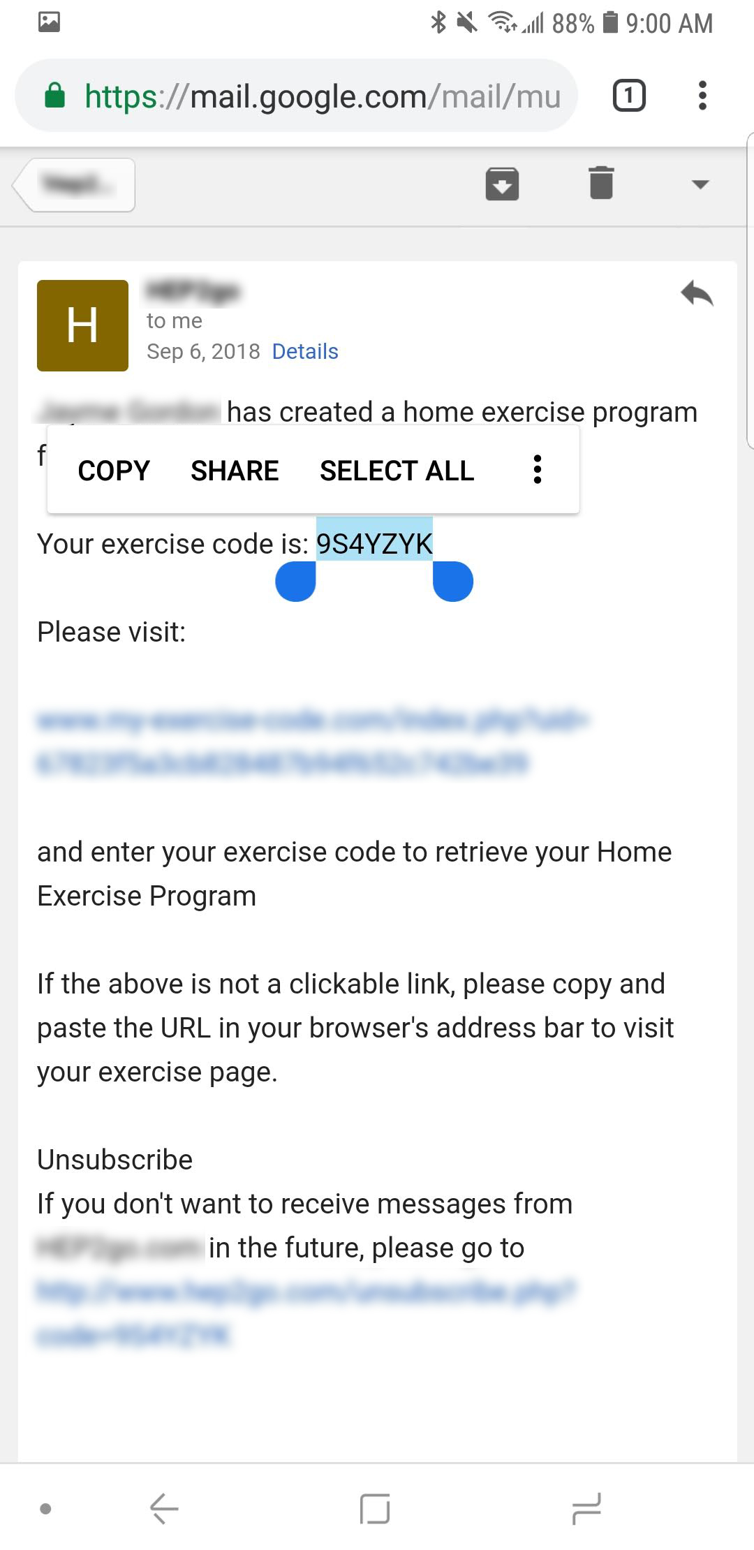
Continuing from this education stage into post-session exercise phase, we learned from our interview with the physiotherapist that some patients struggle to access their exercise routines on the current online home exercise program. From observing a patient who walked us through the home exercise program, they were frustrated with having to open multiple email links and PDFs to get there. When patients do not understand exercise instructions, they tend to wait until the next session to clarify, delaying their recovery. As well, not all patients have access to their physiotherapist’s contact information.
Design Problem and Focus
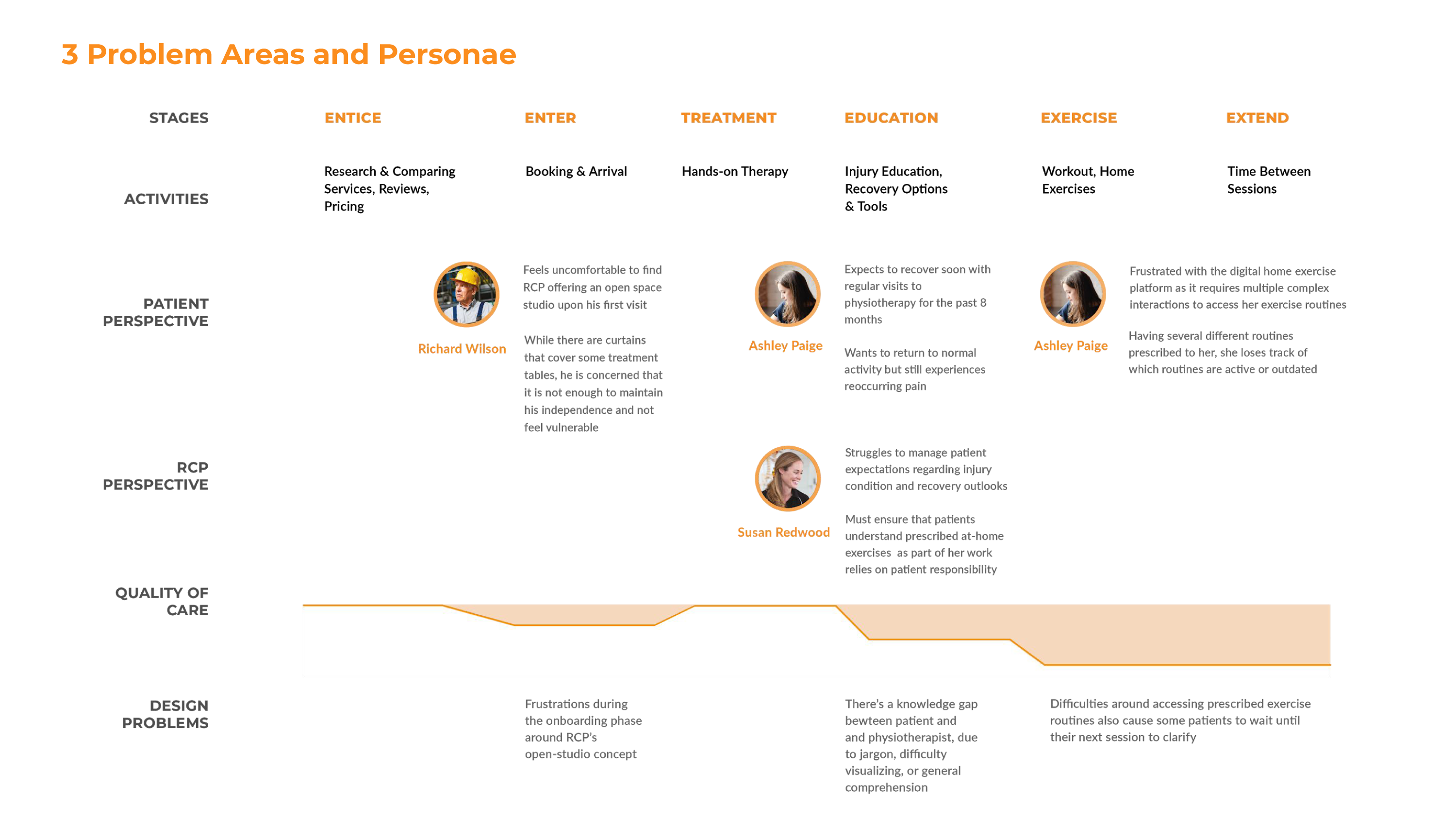
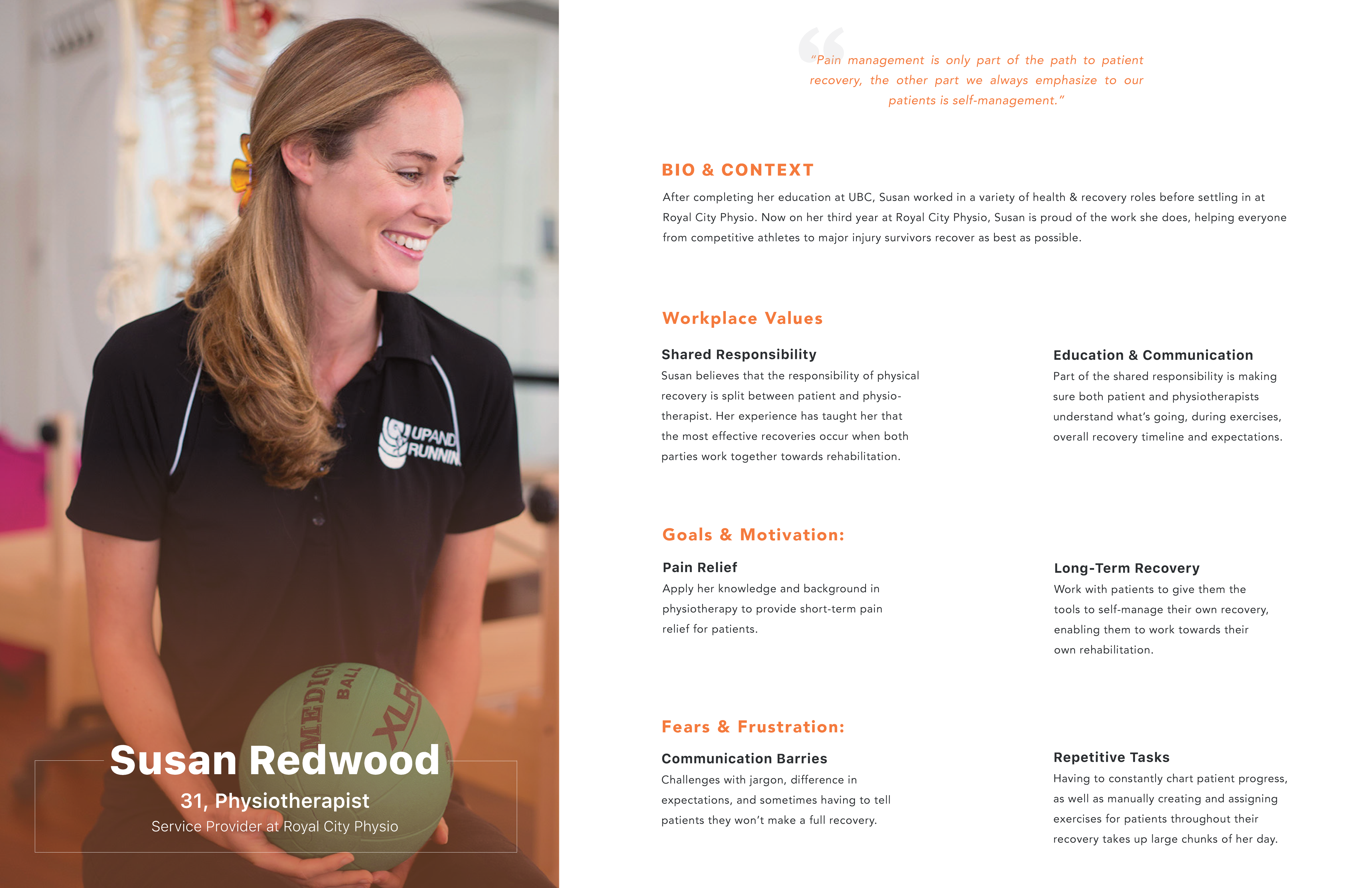
We created three personas and mapped them to a customer journey map to visualize the gaps that emerged between what RCP wanted to achieve in their quality of care and what patients perceived.
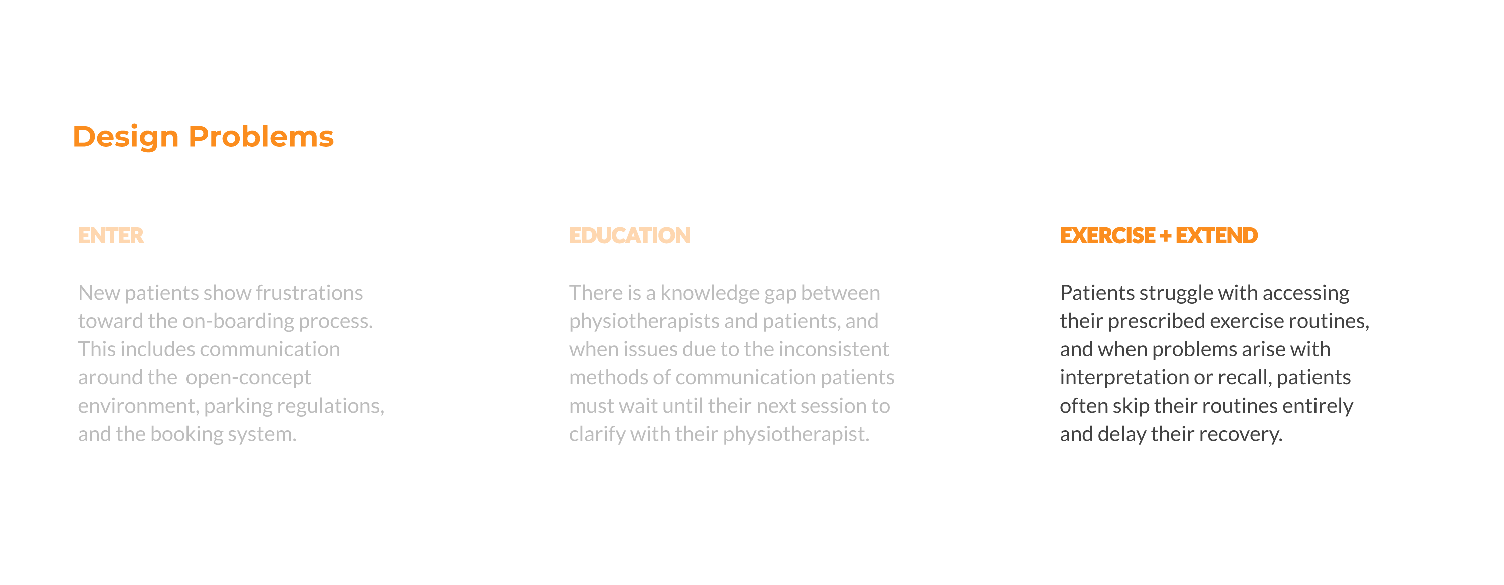
Of the three problem areas, the largest drop in RCP’s quality of care lies in the post-session exercise stage, a result of misinterpreted instructions and poor access to recovery routines. We identified this as our design focus considering that this stage plays a significant part of recovery because it relies on the patient to complete their home exercises. By helping patients overcome their frustrations and understand their physiotherapist’s recommendations, it can contribute to a more effective recovery and thus a more positive perception in RCP’s quality of care. As well, this problem area resonated with RCP the most.
Participatory Workshop
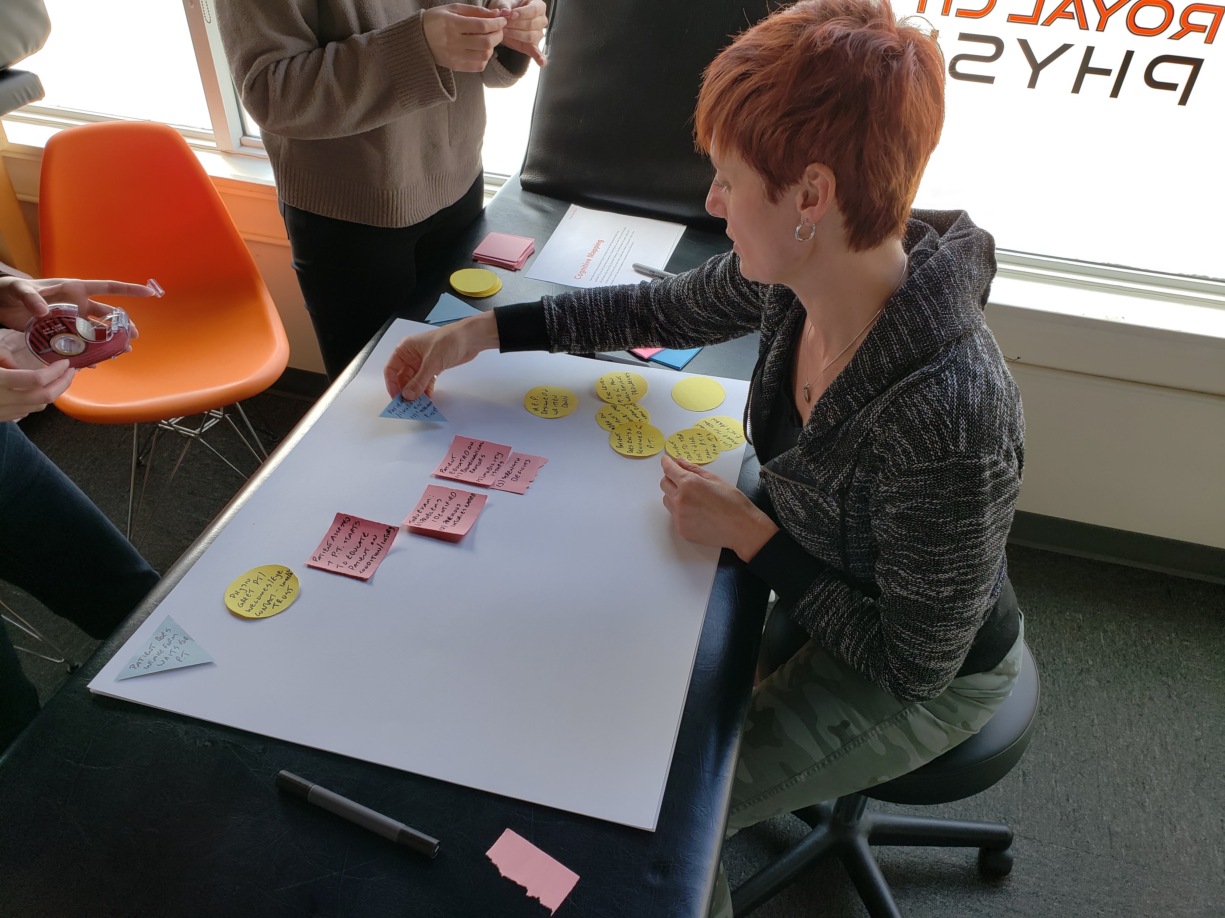
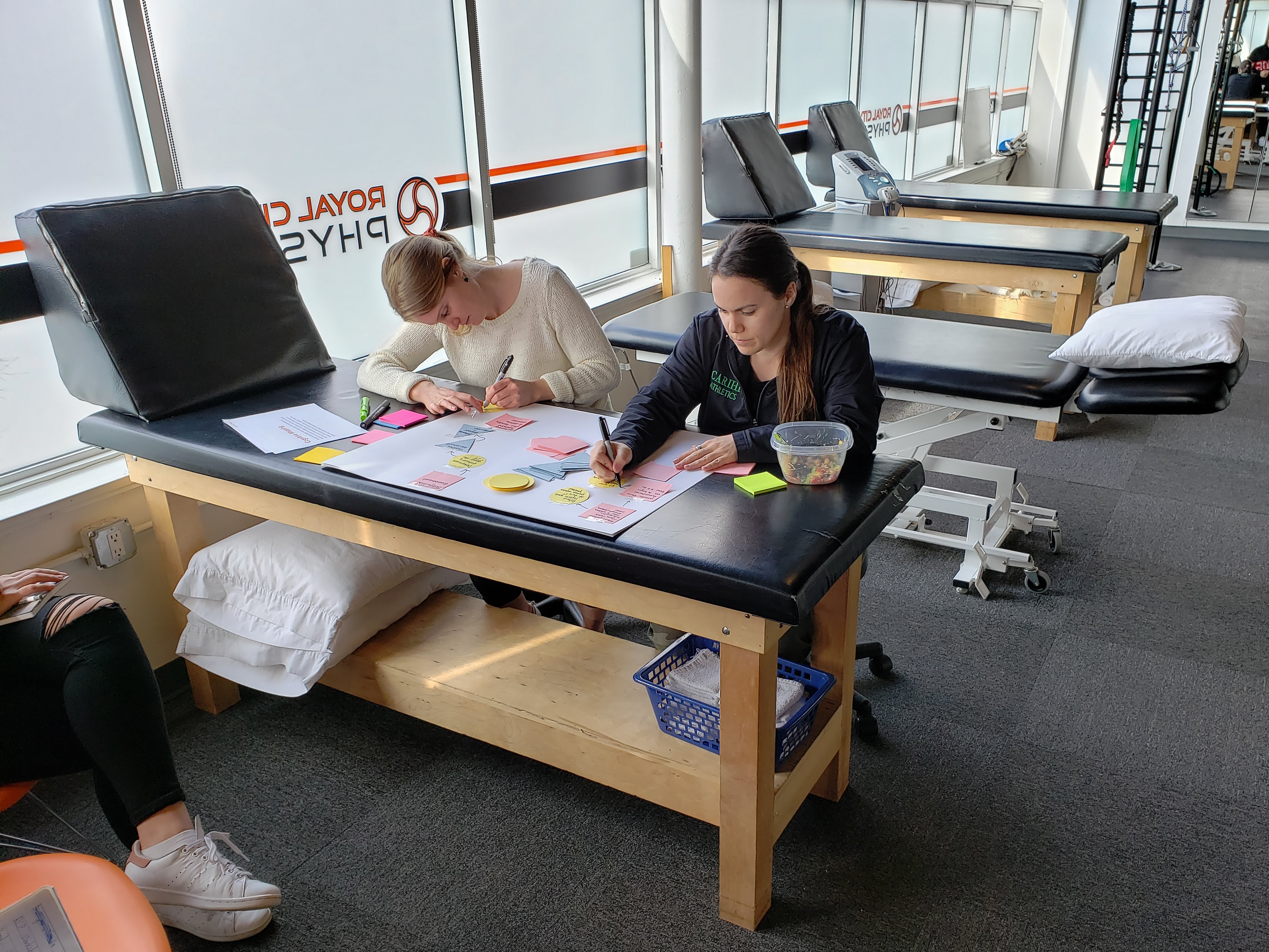
Focusing on the post-session exercise stage, we conducted a participatory workshop to gain a deeper understanding of the home exercise program. We created 2 exercises: (1) cognitive mapping to prompt RCP to lay out the process of how a physiotherapist would create and how a patient would access a customized exercise routine, and (2) H-Form to highlight frustrations and successes with the current home exercise program.
We’ve gained 3 insights from this to explore in our design proposal:
- Patients share recovery tips and artifacts, such as PDFs of their exercise routines, with friends and family which is a source of word-of-mouth customer acquisition.
- Patients tend to have greater buy-in when they see the connection between exercises and the tangible results it offers.
- Showing rather than telling, specifically through video recording, ensures better adherence to exercise routines and improves patient recovery.
Constraints
There were 2 constraints we had to keep in mind:
- Small business with limited resources. A fully-featured app is cost-prohibitive therefore to keep development costs, our solution should be focused solely on the creation and sharing of changing exercise routines.
- No collection or access of sensitive patient information. Medical data requires certification and a specialized developer which can raise development costs. Patients and physiotherapists would therefore access the platform using standard logins, with no tie-in to existing platforms that have patient information.
User Flows


I created a refined set of user flows of key use cases for both the physiotherapist and the patient view to help guide the team in creating high-fidelity mockups.
Proposal
Given our constraints and solutions we considered, to resolve RCP’s drop in post-session care, our proposal is a home exercise program (HEP) web platform that serves two key stakeholders - physiotherapists and patients.
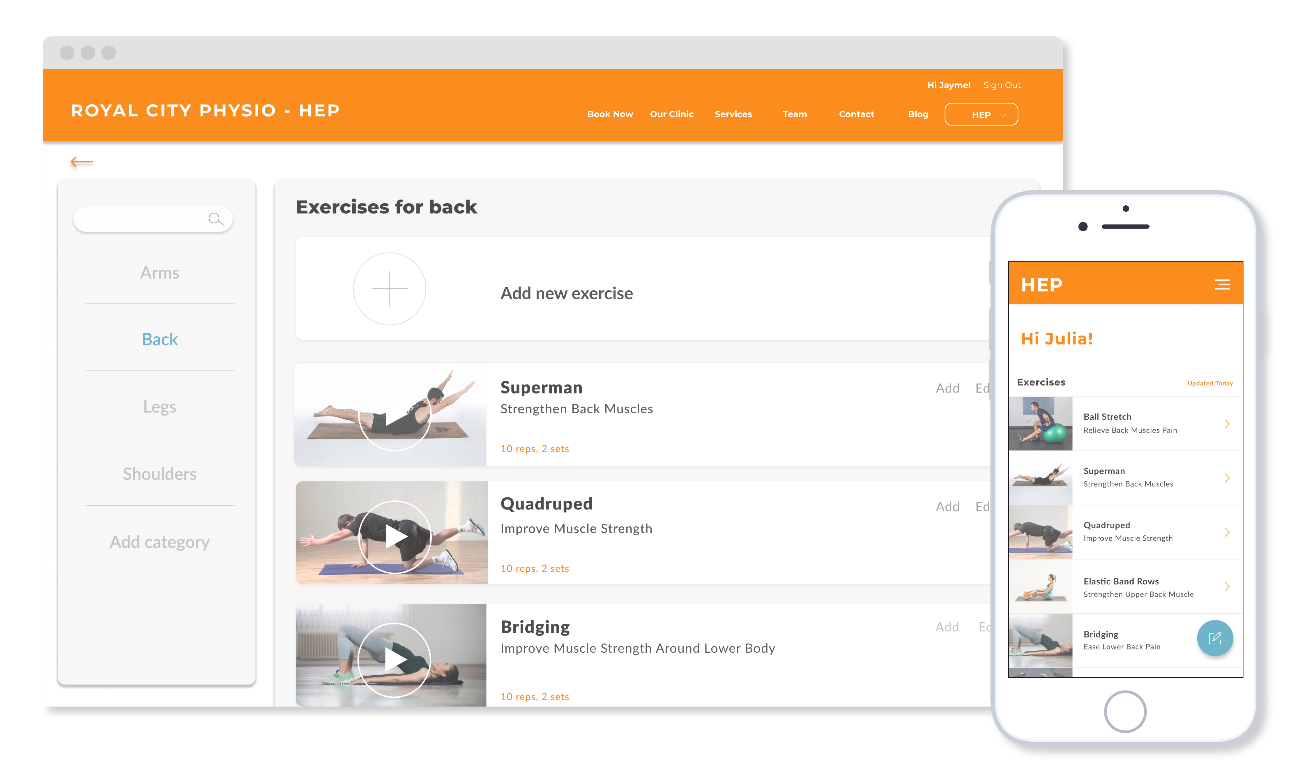
Assists physiotherapists in creating custom tailored recovery routines for patients, and delivering them in a consistent fashion.
These routines can be quickly created in-clinic alongside the patient, by leveraging commonly used recovery templates and modifying them as needed.
Affords easy access to routines across both digital and print mediums, with a priority on patient comprehension of each exercise and its benefit to their recovery.
These are primarily accessed off-site, with patients being able to use their phones or even printed sheets depending on what they’re comfortable with.
By providing a centralized recovery guide complete with video tutorials and text instructions that are easily modifiable for each patient, our intended outcome is to increase patient buy-in and commitment to exercise routines while reducing workload for physiotherapists.
Physiotherapist View
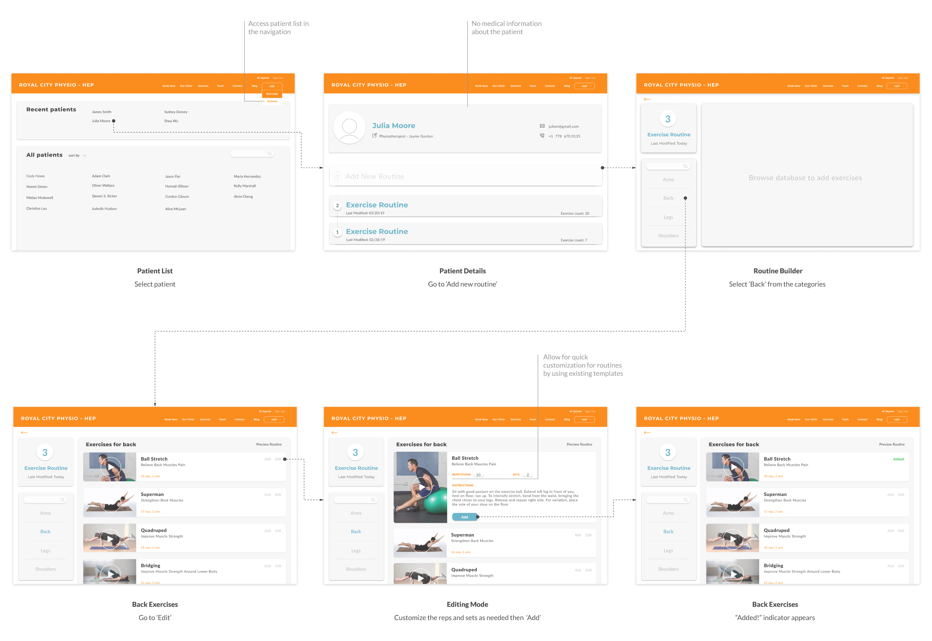
I worked with my team to develop a mockup that considers how a physiotherapist would create a new back exercise that will be added to a new exercise routine for a patient.
Creating a new exercise
Once signed into RCP’s website, the home exercise program can be accessed in the navigation. From then, a physiotherapist would select the ‘Back’ category and create a new exercise by filling out a form. In this form, there is a field to describe the benefit or value of the exercise to help patients understand how this exercise is helpful. Videos may be uploaded as it is a common and effective form of explanation for exercises.
Creating a new routine
To add this exercise as part of a new routine, navigate to the ‘Patients’ dropdown then select a patient. Within the patient’s profile – which has no medical information, adding a new routine will prompt the physiotherapist to look for exercises based on category. Exercise templates are easily customized by reps and sets as needed for a patient.
Releasing routines
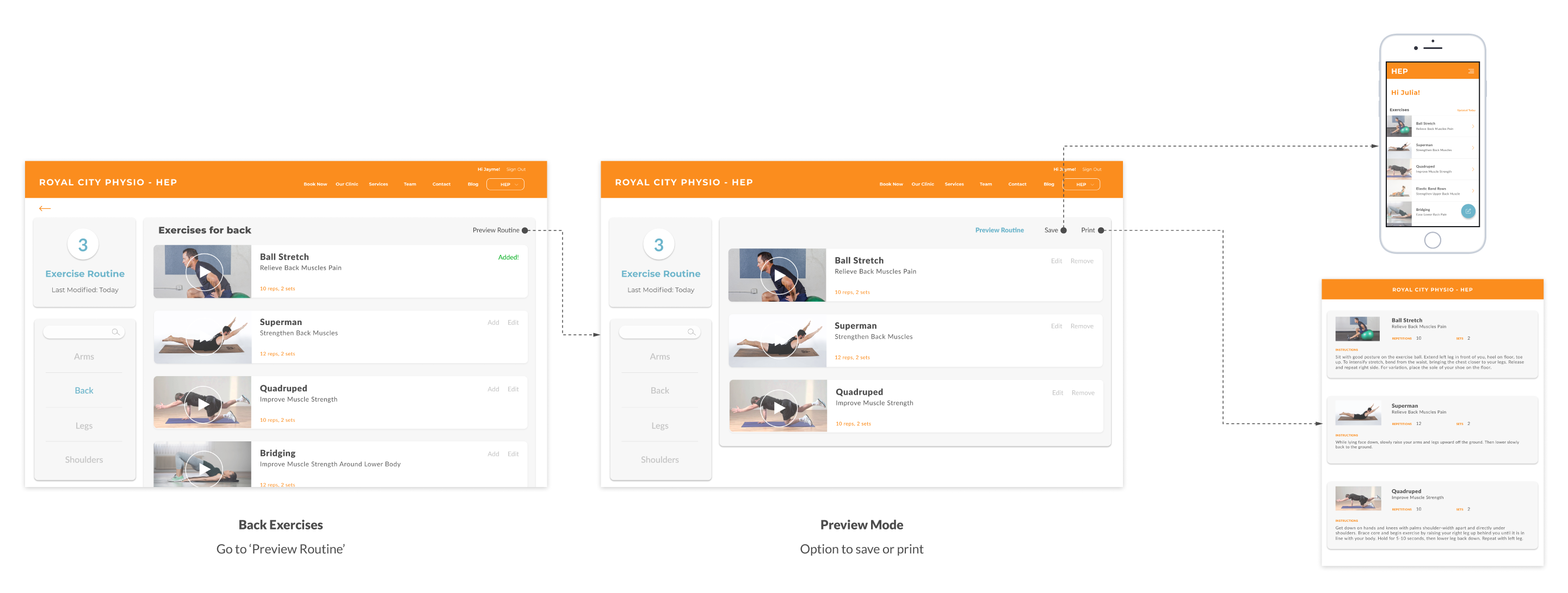
When more exercises are added, the exercise routine may be viewed via ‘Preview Routine’. From here, the physiotherapist may ‘Save’ so that the patient receives it digitally when they login or ‘Print’ if the patient requests a physical version. This PDF also serves as a branded touchpoint.
Patient View
We also considered how a patient would go through their exercise routine on their mobile phones and make note of any questions or concerns to bring up with their physiotherapist.
Exercising along
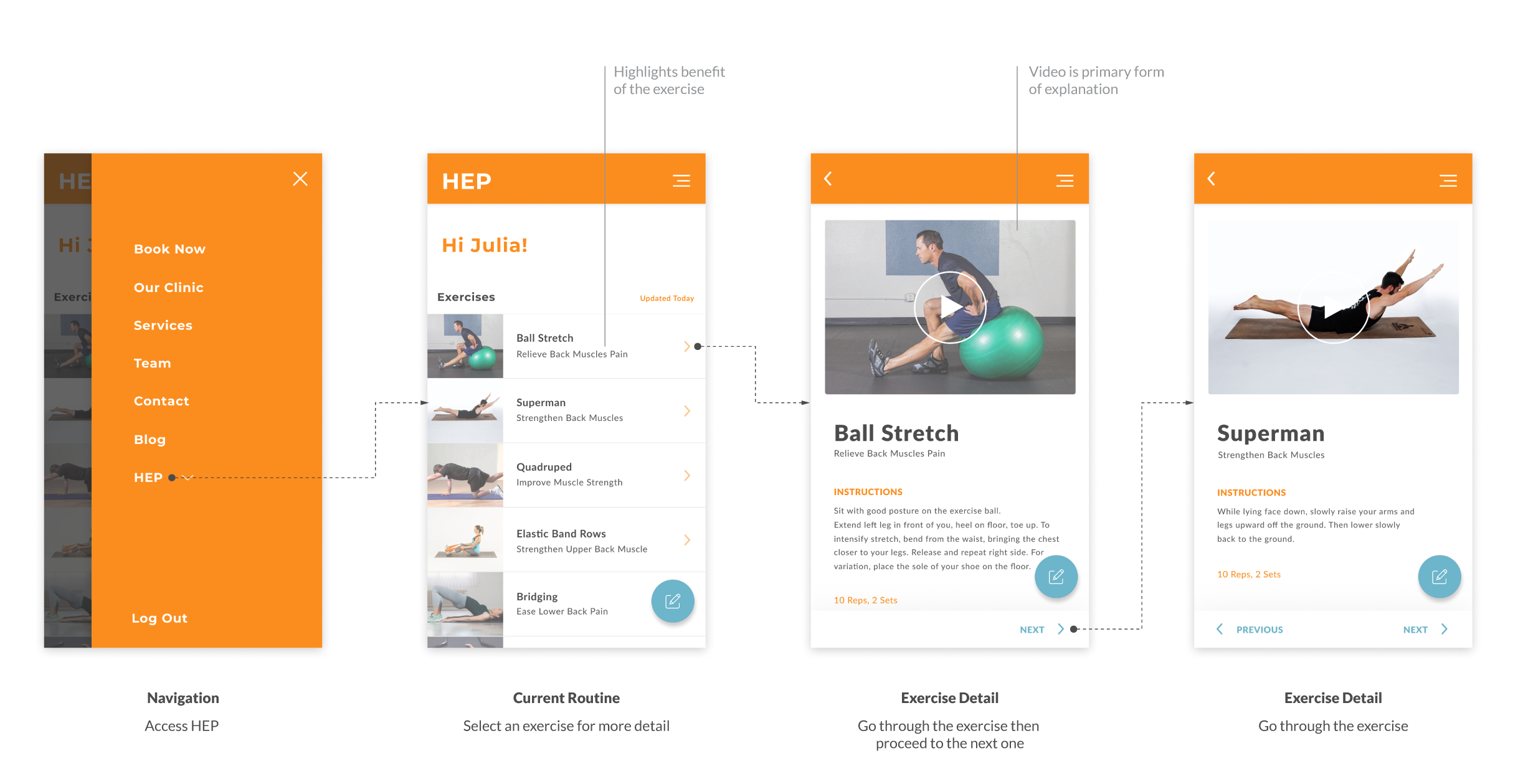
Once signed into the RCP’s website, the HEP can be accessed in the navigation and their latest routine consisting of a list of exercises will be displayed. Clicking on an exercise will direct to a detailed page for further explanation.
Catching concerns
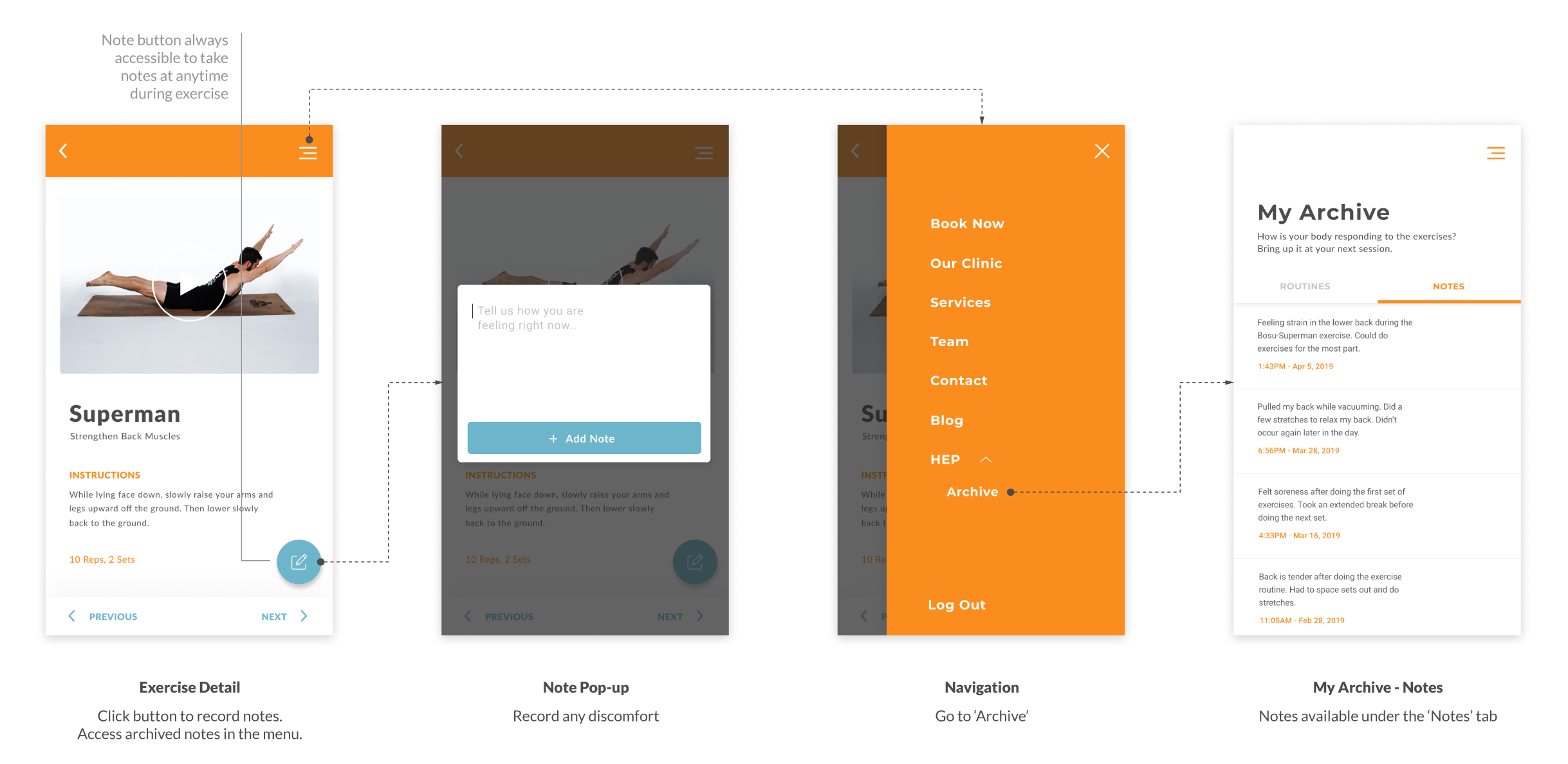
If a patient encounter any questions or concerns, such as areas of discomfort, at any time during an exercise, they may tap on the floating note button to document it and share it with their physiotherapist at their next session. Archived notes are accessed via the navigation.
Retrieving old routines
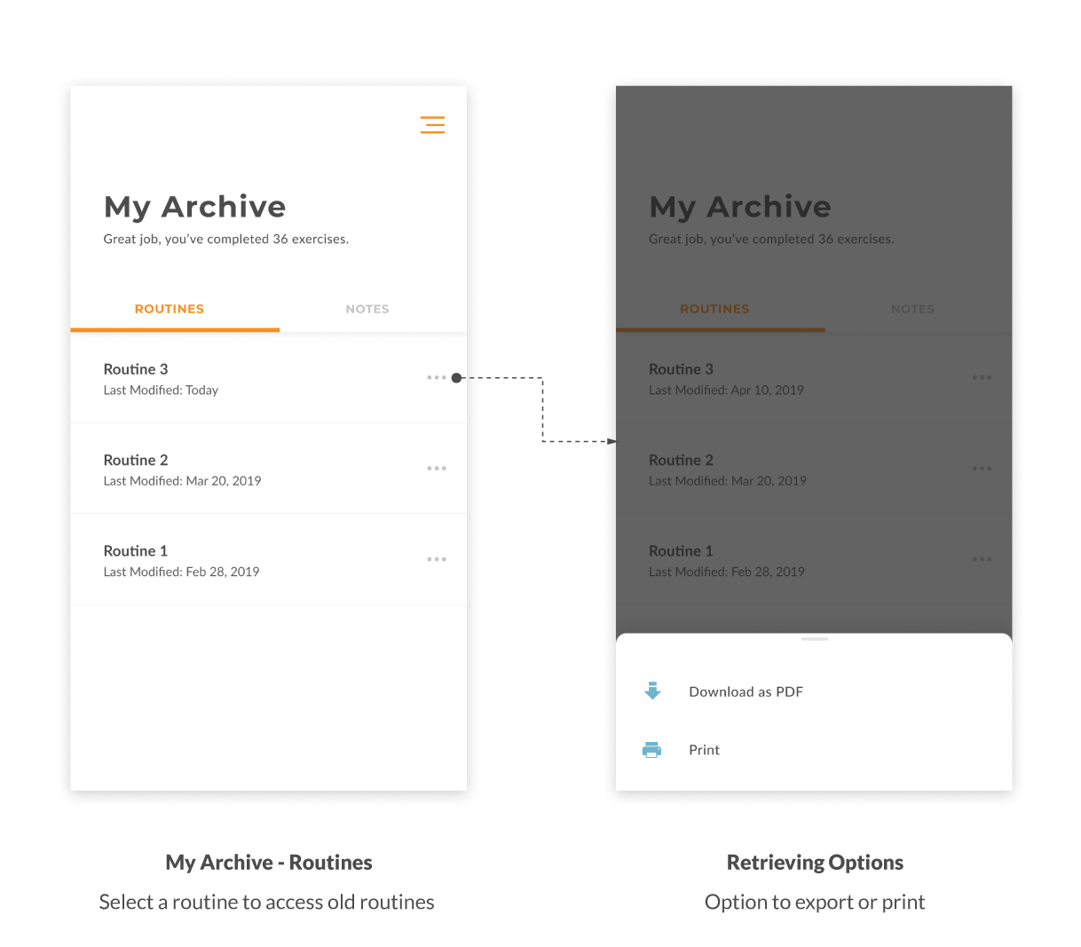
Also within this archive are old exercise routines where patients also have the option to print or download as a PDF. With some patients asking their physiotherapist for copies of their old exercises as discovered through our interviews, the HEP web platform affords the ability to access it while saving physiotherapists the time to look for it.
Iteration
I revisited the desktop interface to address a few usability concerns:
- Removing Redundancy: In the UI revision, clicking on HEP in the navigation takes a user directly to the database. I removed the first page of categories in the original UI as exploring and adding new categories are already affordances in the following page, the exercise database.
- Consistent Navigation: There is no longer a dropdown for HEP in the top navigation. In the original UI, logging in as either physiotherapist or patient results in two different dropdowns in the navigation. By creating different variations on a site-wide element such as the navigation, a person may suspect what else might not be consistent on the site.
- Appropriate scale: The iteration is scaled down from the large fonts, very wide elements, and large white spaces of the original UI. The screen real estate is better utilized on desktop whereas before it could be mistaken for tablet-sized viewing. Particularly for the physiotherapist view where most physiotherapists are in their 30s or 40s, slightly smaller fonts and elements than the original would be comfortable for this age demographic.
Reflection
Although an academic project, we had exposure working with a client on a UX project and had to consider real-world limitations of not only financial resources but time and patient privacy as well. Despite these limitations, through learning and applying the various interaction methods of ethnography studies and participatory workshops, we were able to gain a good depth of knowledge and maximize the few on-site visits with had with RCP. Taking this research to a well-grounded prototype, we scoped this project to manageable goal where we as a team of experience designers can identify a business problem and design a proposal that is realistic for a small business to implement.

