Railyard Labs at Dossier Creative
Design Intern
Railyard Labs is an intern-powered studio within Dossier Creative where business and design thinking meet to bring branding solutions for clients in the social impact space. Led by Railyard manager, Cherihan Hassun, and well as mentored by Dossier’s team of strategists, designers, project managers, production designers, and lead web developer, I gained a deep understanding of bridging brand strategy with visual design while learning to empathize with clients in an agency environment. Our cohort worked with three clients: RADIUS SFU, refresh, and Mission Possible.
Due to existing NDA, process work cannot be published.
Team
Joshua Fan, Gabriel Hendry, Robbie Sebullen, Hussam Zbeeb
Type
Internship
Role
Visual design, Business strategy, Web development, Client relations
Tools
Illustrator, Photoshop, Keynote, WordPress
Duration
May 2018 – Sept 2018
RADIUS SFU
RADIUS SFU is a social innovation hub that nurtures radical ideas into useful solutions through a learn-by-doing approach and equipping aspiring changemakers to make economic transformation happen. With RADIUS’ growth and expansion of services over the years, they sought for a brand refresh to better capture their matured organization.
For RADIUS, I was responsible for creative strategy, which involves transforming the brand strategy into visual styles and applications for logos, website concepts, and other print/digital material, as well as leading the front-end web development.
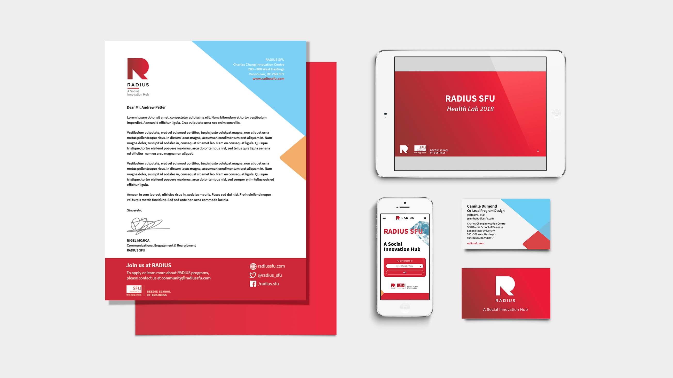
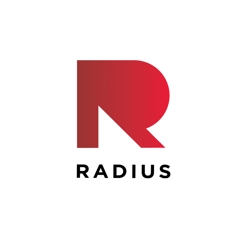
From the brand strategy, I developed a few options for visual style and RADIUS identified strongly with the dynamic, bold, energetic, confident, and adaptive identity. The result is a visual identity that uses a bright colour palette, but still reminiscent of their old brand colors, as well as a sans-serif font of a heavy weight emphasized by contrast with lighter ones to speak to boldness and confidence; and candid, in-situ photography of people to showcase energy and dynamism. For the logo, it retains the previous letter R logo but is made more contemporary and uses a gradient to reflect dynamism and adaptiveness. For their brand element, which is also a modernization from their old branding, coloured triangles are used as a device to represent their different service offerings.
Original
New
To clarify their service offerings in the new website, we developed and user-tested a new information architecture with key personas in mind: social entrepreneurs, working professionals, and students. From information architecture to wireframes, I then developed the front-end of the website. This website is highly customized to match the RADIUS brand with drag and drop functionality to give RADIUS the flexibility to restructure existing pages and build new ones.
Read more about RADIUS SFU here.
refresh
refresh is a water governance lab that pioneers a social innovation approach to address water governance challenges, such as urbanisation, population growth, and climate change. They aim to be facilitators for systems changemakers – academics, legal experts, government bureaucrats, and First Nations representatives – to collaborate. With the Columbia River Treaty undergoing modernization, refresh was born and needed a brand to support their mission of creating meaningful change in water governance.
For refresh, I was responsible for creative strategy and being the point of contact for Railyard.
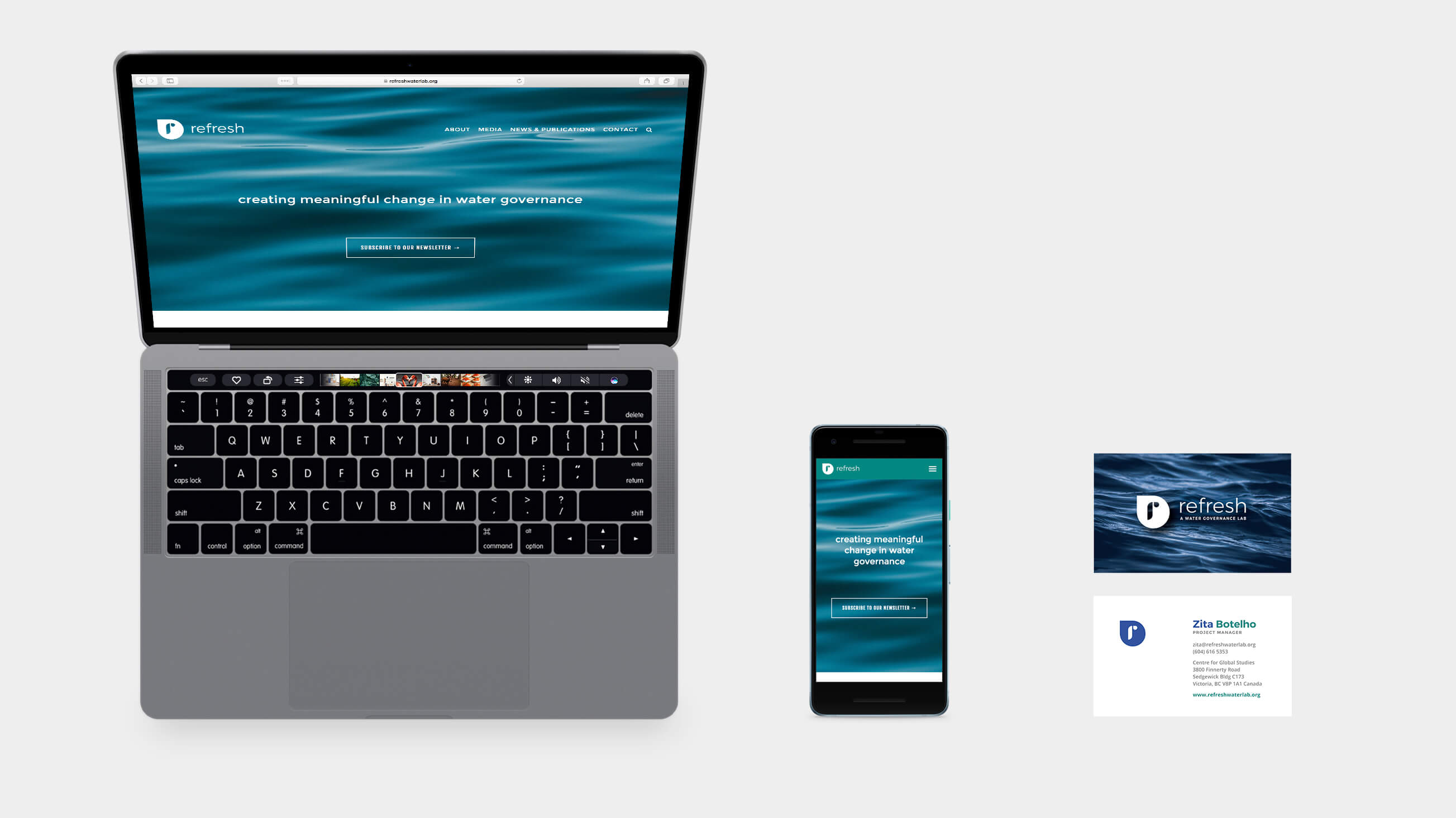
From the brand strategy, refresh identified with knowledge, continuous learning, open-minded, credible, integrated, big-picture thinker. The result is a visual identity that uses a muted blue and green colour palette to reinforce that refresh is within the water governance space as well give a serious, academic feel reflecting knowledge, continuous learning, and credibility; a round and wide sans-serif font emphasized by contrast with a tighter font to suggest open-mindedness and approachability; and aerial photography to speak to the big-picture thinker. For the logo, it is a representation of integration and inclusion, with the ‘r’ enclosed within a water droplet. Lastly, the brand element is a water topography pattern to further support refresh’s position in the water governance space.
At this time, the refresh website is not yet launched. However, you can read more about refresh here.
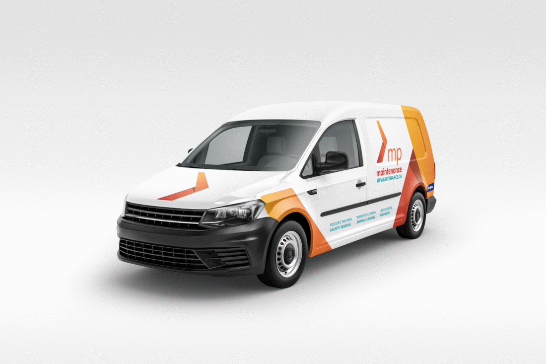
Mission Possible
Mission Possible is a community economic development agency that empower individuals who face employment barriers to equip themselves with a renewed sense of dignity through meaningful work. With Mission Possible evolution over the past 10 years, they sought for a brand refresh to better capture their organization that champions a hand-up approach, rather than a hand-out approach they were previously known for.
For Mission Possible, I was responsible for brand and creative strategy, with most of the visual design work on printed material.
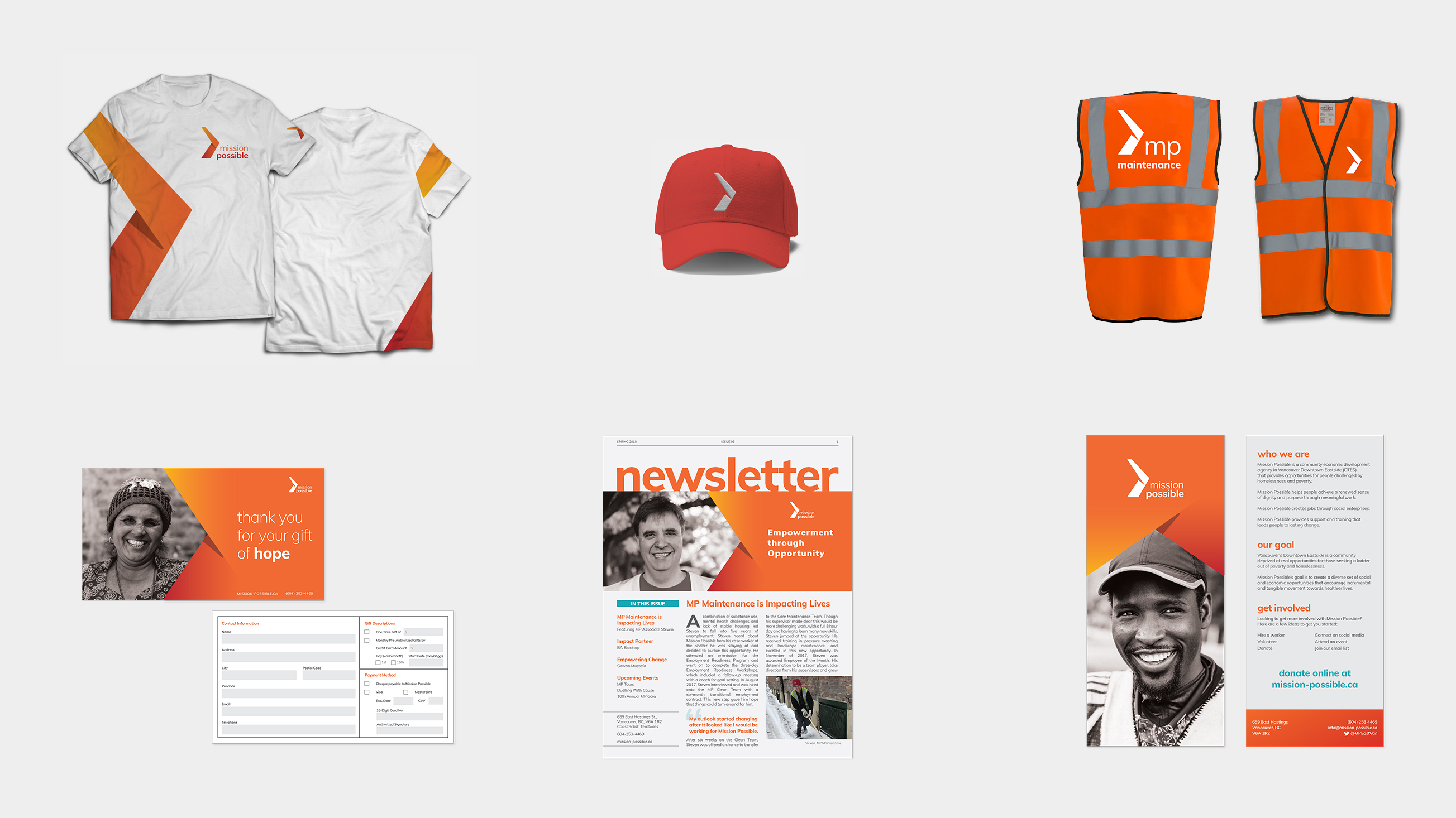
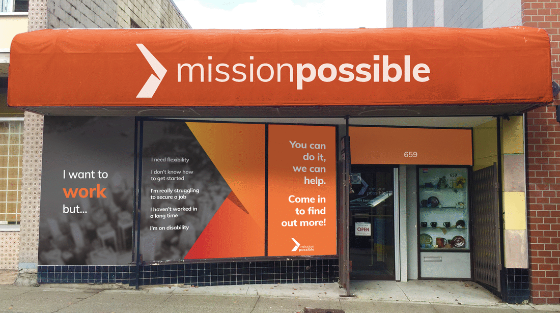
Working with Mission Possible to understand the organization as well as researching other players in the economic development industry, I crafted a brand strategy to help Mission Possible and their audience understand and align on their brand DNA. From the brand strategy, Mission Possible identified with optimism, empowerment, progression, tenacity, and inspiration. The result is a visual identity that uses a bright colour palette that represents optimism; a round and wide sand-serif font to also reflect their friendly, optimistic character; as well as a mix of portrait and candid, in-situ photography to inspire and showcase the feeling of tenacity and empowerment. For the logo, the arrow and the gradient within is a representation of progression. The brand element is a variation of the logo mark and is used to frame content.
Read more about Mission Possible here.
Original
New
Reflection
Railyard was a place of many ‘learnings’ – a word that is much valued within Dossier. Prior to being an intern, I was eager to learn about the interplay of business and design as my background in marketing and visual communications provided a limited view. Now closing the knowledge and skills gap is a deep understanding of the components that make up the brand DNA; how to transform brand DNA into a creative strategy; and how to work with and present to clients but also to emphasize with them as well. All this was possible due to being given a lot of flexibility in undertaking multiple roles – for myself I took on visual design, brand strategy, web developer, and client relations – and working within a tight-knit agency environment. Though, what made the experience all the more special was having immense support and mentorship from Dossier throughout the way, helping unique clients make a social impact, as well as giving me the confidence to tackle the freelance world.