VIA Rail
Website Design
VIA Journey is a website redesign that invites tourists to consider VIA Rail as a desirable option for tourism within Canada among other common alternatives. Our goal with VIA Journey was to better entice travellers to discover the value of VIA Rail’s unique journey-based experience, as well as to help VIA Rail re-establish their market positioning and competitive edge in the tourism industry.
My role in this project was mainly focused on market and industry research and analysis, ideation on the project’s form and features, interaction studies, as well as content strategy and writing for our weekly presentation slides and scripts, and video. I also held smaller roles in graphic, UI, and interaction design in the initial weeks of research and ideation.
Team
Joshua Fan, Michelle Ng, Gabriel Yeung, Grant Zou
Type
Academic
Role
UX, Market research, Ideation, Interaction studies, Content writing and strategy
Tools
Illustrator, Photoshop, After Effects, Premiere Pro, Keynote
Duration
4 weeks
Deliverables
SlidesProcess
Business Problem
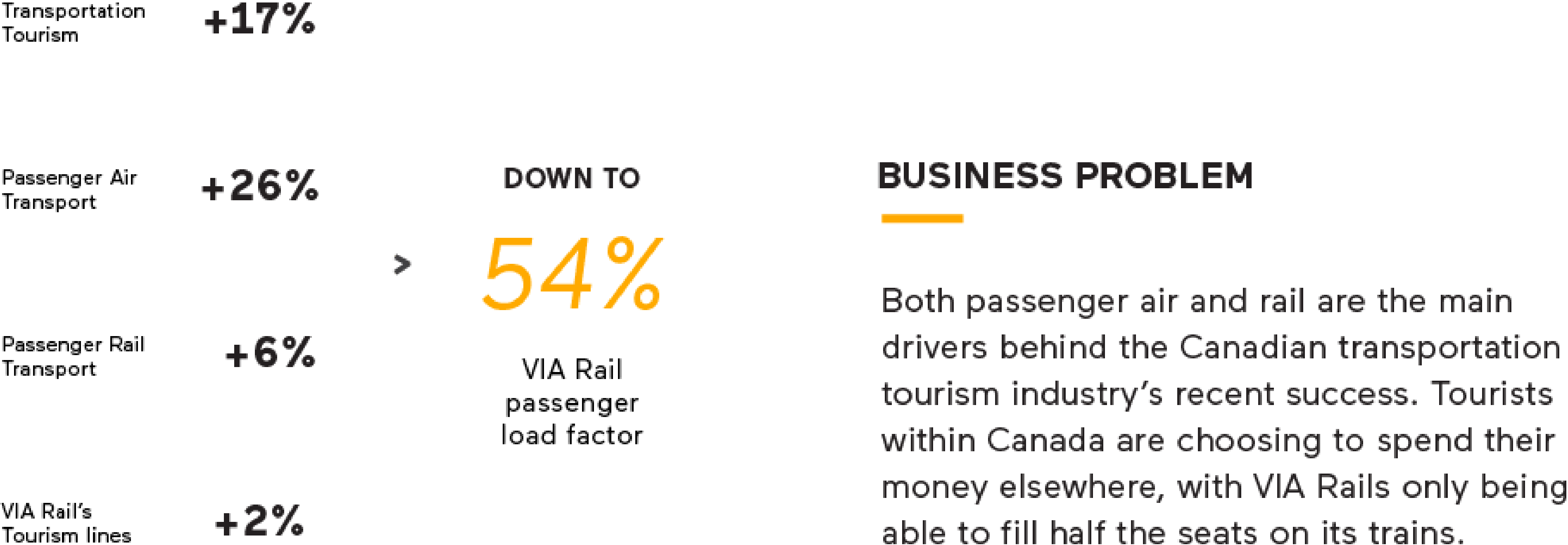
With the recent surge in demand for Canadian tourism travel, air and rail services are performing well. However, VIA Rail is struggling to fill half of their seats, notably attaining an average passenger load factor of only 54% in 2016 (Annual Report 2016). As well, despite providing Canada’s only coast-to-coast rail service, tourists are still choosing to spend their money on other means of tourism travel resulting in VIA Rail seeing stagnating ridership numbers since 2014. Our challenge is to increase the number of riders on VIA Rail as well as influence potential customers to consider VIA Rail as a desirable travel alternative.
The Brand
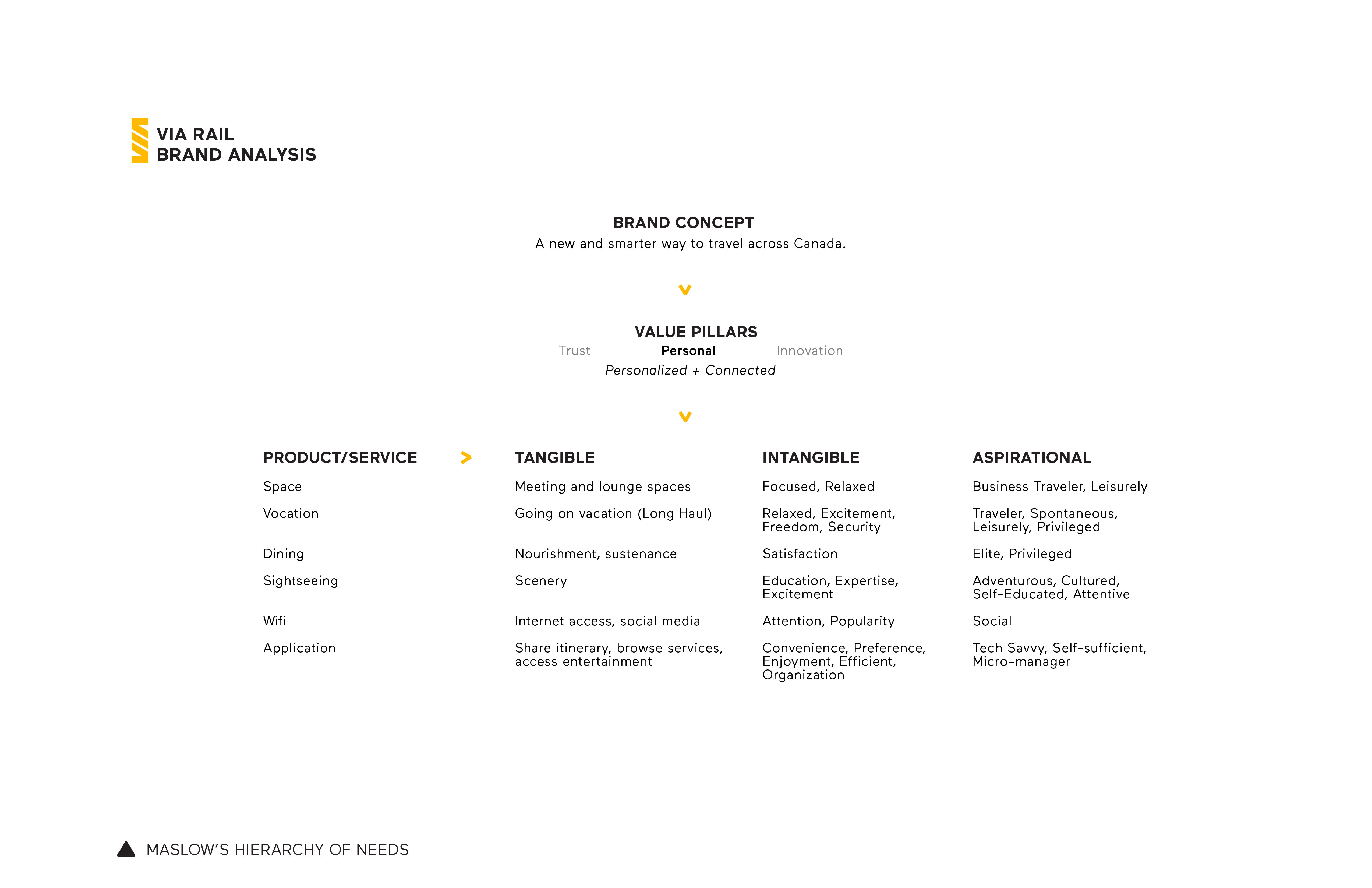
Using the Brand Value Pillars Framework from Patrick Newbery and Kevin Farnham’s Experience Design book, we identified VIA Rail’s brand concept and the value pillar that not only best supports the brand concept, but we, as designers, can help reinforce. Among the brand pillars, we believed Trust and Innovation were outside our control. Therefore, we performed a deep dive into Personal, which is defined by VIA Rail as Personalized and Connected. Working with Connected, I helped pinpoint the products and services that are tied to it and determine the tangible, intangible, and aspirational values delivered. From this analysis and other research, we learned that, compared to other means of tourism travel, VIA Rail offers a unique experience to discover Canada for a justifiable cost, reinforcing that VIA Rail is a new and smarter way to travel across Canada. So, if a unique value proposition exists, why are potential passengers not connecting with VIA Rail’s service?
Market Positioning
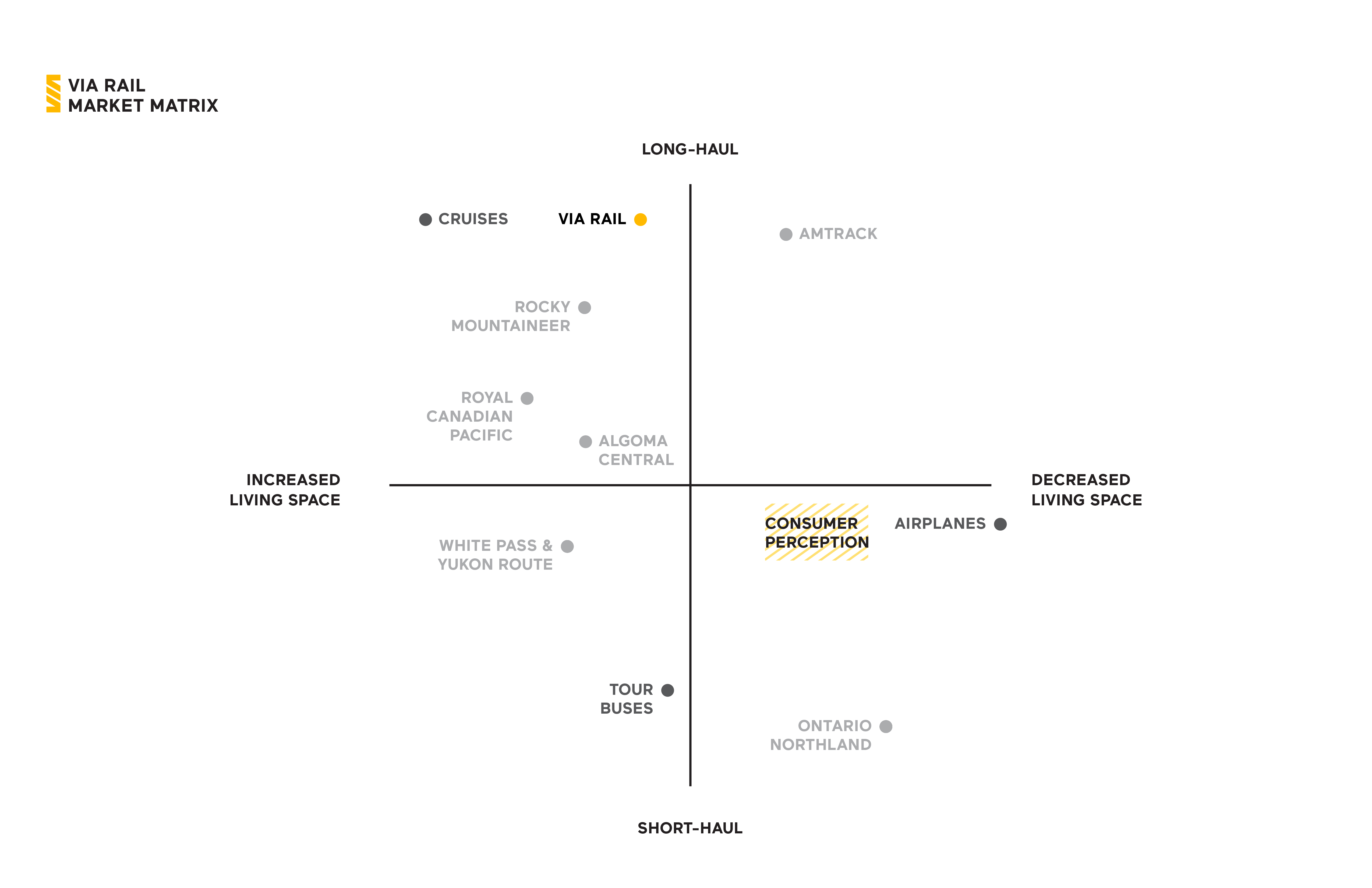
The Market Matrix gave us a better understanding of the business problem. I assessed VIA Rail’s market positioning based on two attributes: distance covered and living space provided. Living space includes having the freedom to move, comfortable accommodations, meal service, and a range of on-board activities. While VIA Rail positions themselves as providers of long-haul and good living space, common consumer perception places VIA Rail against short-haul, decreased living space services such as airlines. But, relative to airplanes and not revealed in this Market Matrix, VIA Rail costs more and takes more time to get anywhere. With this perception misalignment, VIA Rail is challenged to overcome it.
The Opportunity
With Connectivity, which we found is further reinforced in VIA Rail’s future strategic vision for the brand called Destination 2025, as well as the insights from our brand and market positioning analysis, we saw an opportunity to pursue this brand pillar to drive our project and increase the perceived value relative to other forms of tourism transportation. We wanted to highlight VIA Rail’s best assets that gives them the ability to offer a journey that is as valuable as the destination itself. To do so, we aimed to better connect potential customers with unique narratives across Canada.
Customer Segment

Looking from a customer’s perspective, our team first identified three customer segments. We chose to focus our efforts toward first-time customers as they are likely to hold preconceived notions about long-haul rail travel and therefore are less likely to see the value proposition that VIA Rail offers.
Persona
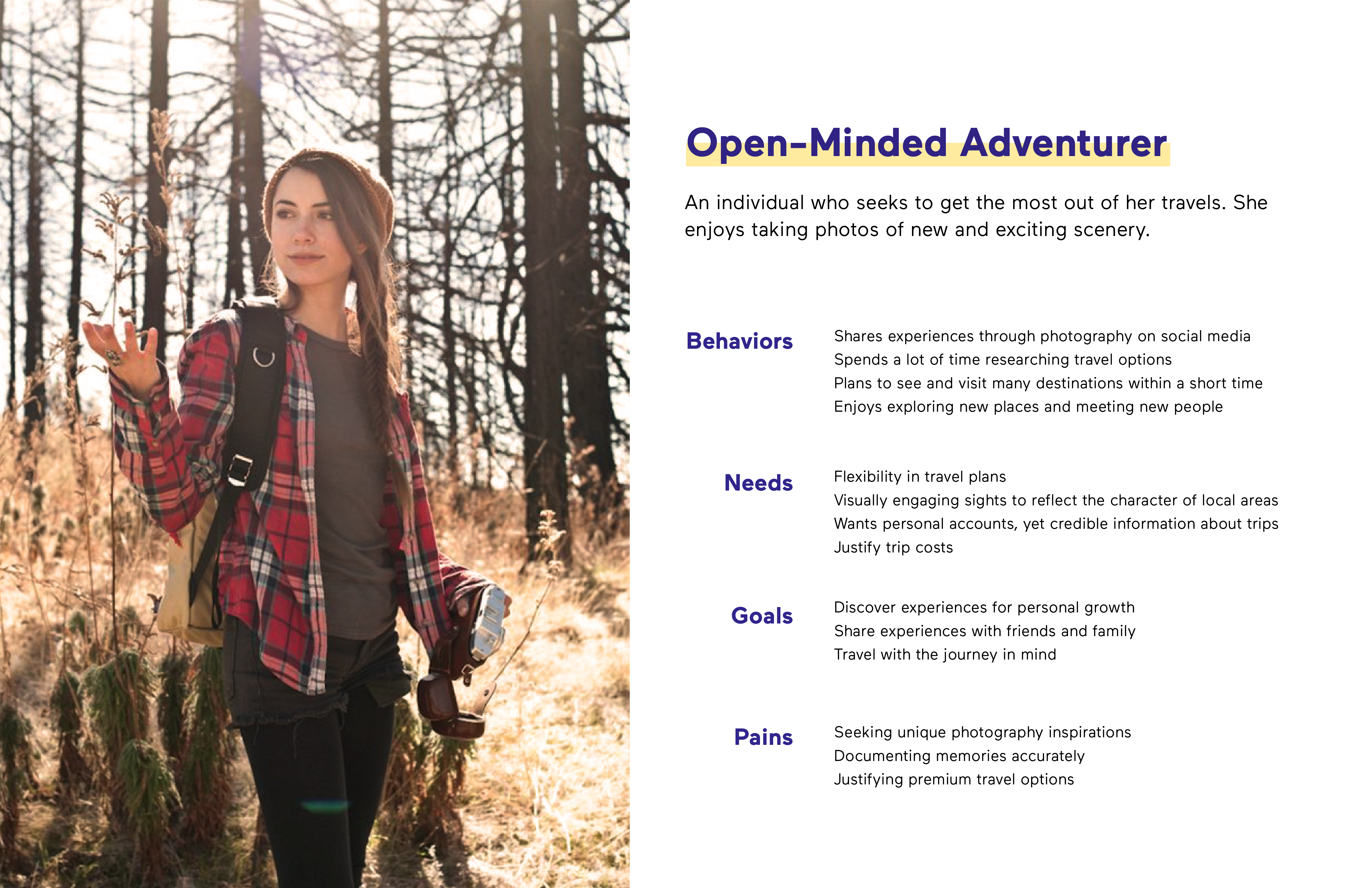
Based on anecdotal reviews of VIA Rail, I created a persona to help guide the team in understanding the kind of traveler we are designing for, as well as where in the customer journey framework VIA Rail is finding it most challenging in shifting perception of rail travel.
The Customer Journey
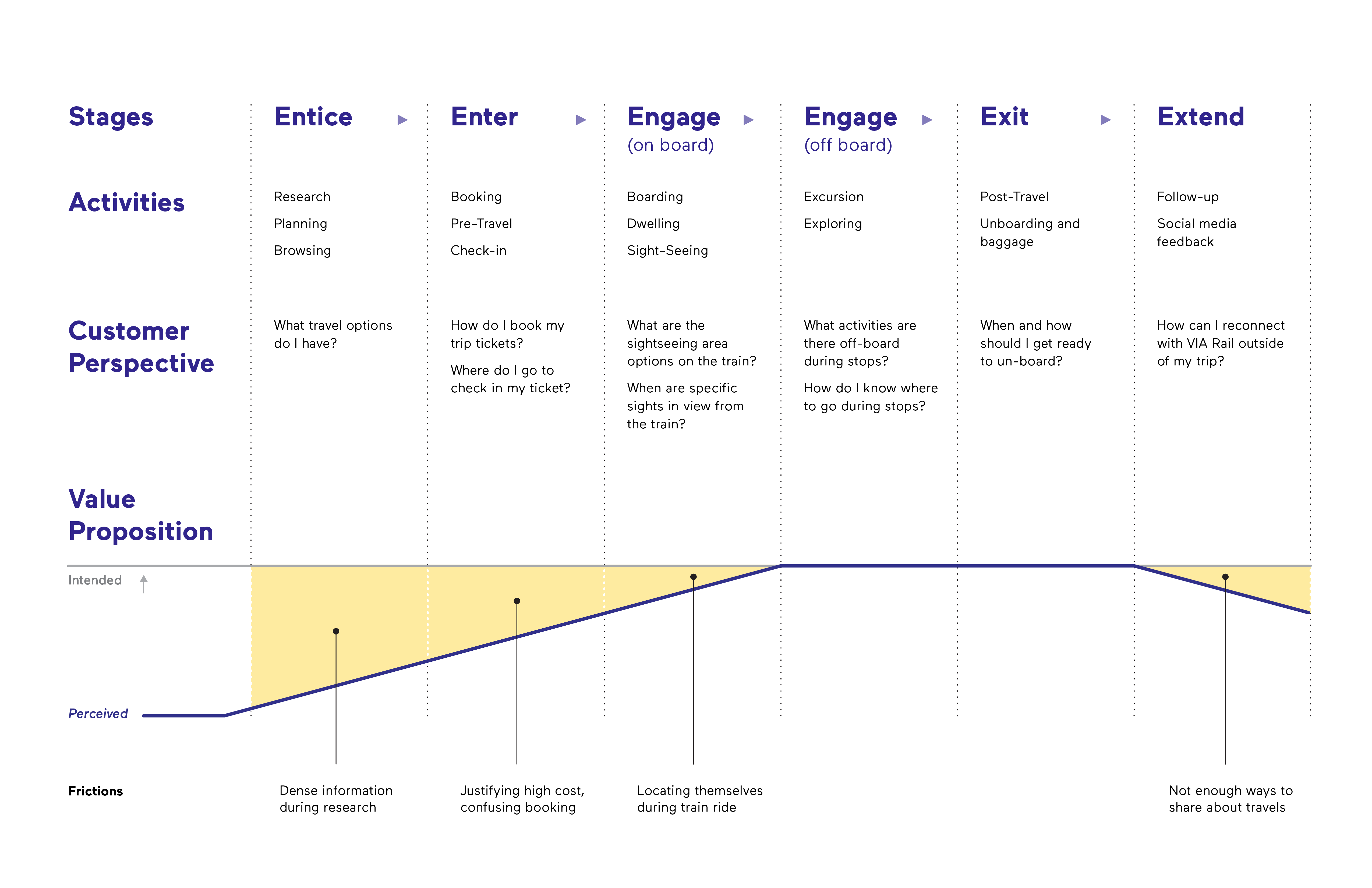
We developed a customer journey framework which was borrowed from Engine Digital’s model. From identifying the stages in the journey framework and the frictions within, we learned the gap between the VIA Rail’s intended value proposition and the customer’s perceived value proposition is greatest within the entice stage.
The Customer Map
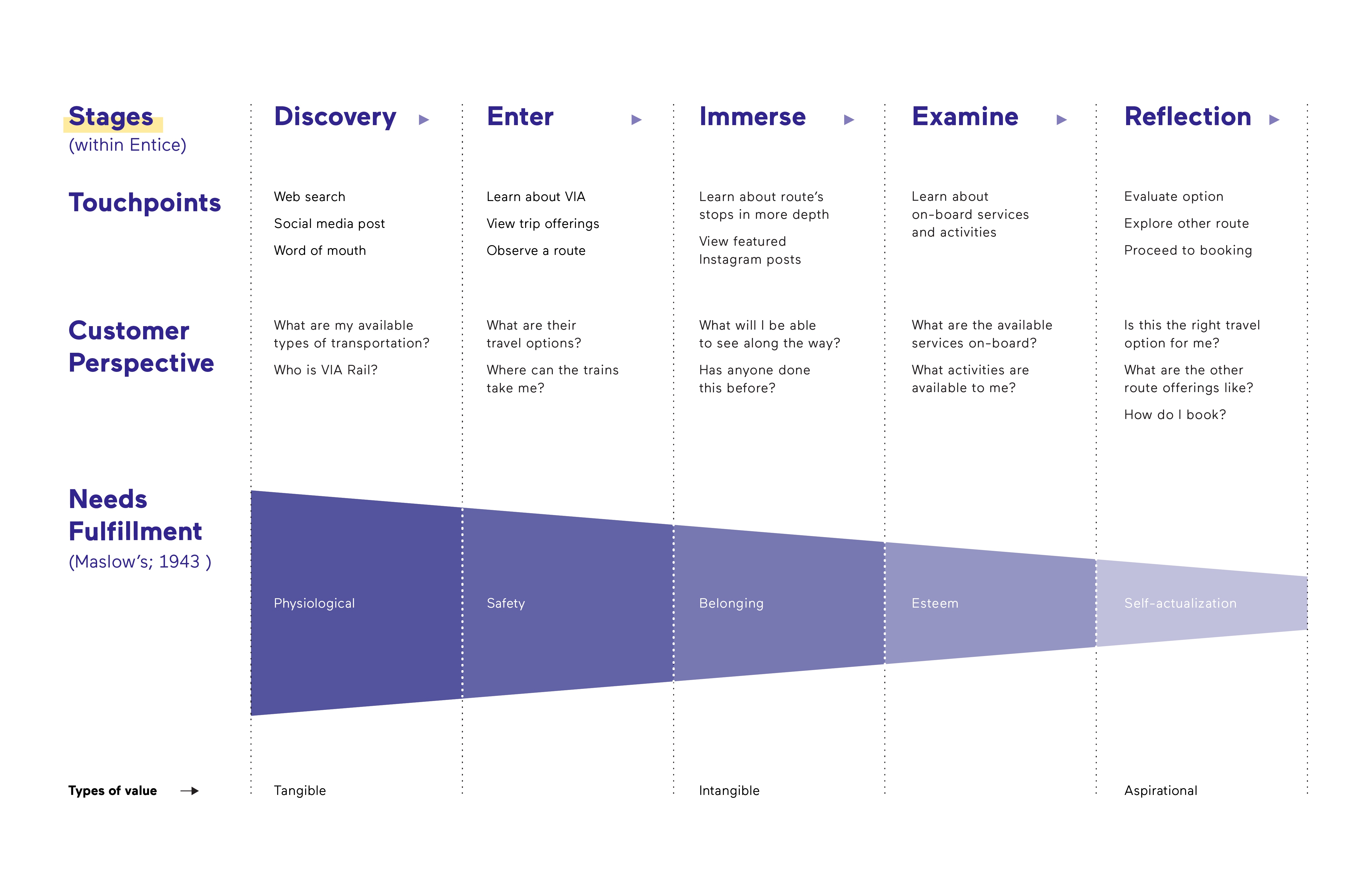
Choosing to intervene at the entice stage, we broke this stage down further and realize a close association with Maslow’s Hierarchy of Needs. We understood that when basic needs are met, people are motivated to achieve higher level goals. Our strategy was to therefore organize the value proposition in our digital solution so to present tangible, intangible, and aspirational values in this order as they progress through the entice phase. Upon exploring VIA Rail’s website, we saw a key opportunity in enticing customers.
Frictions
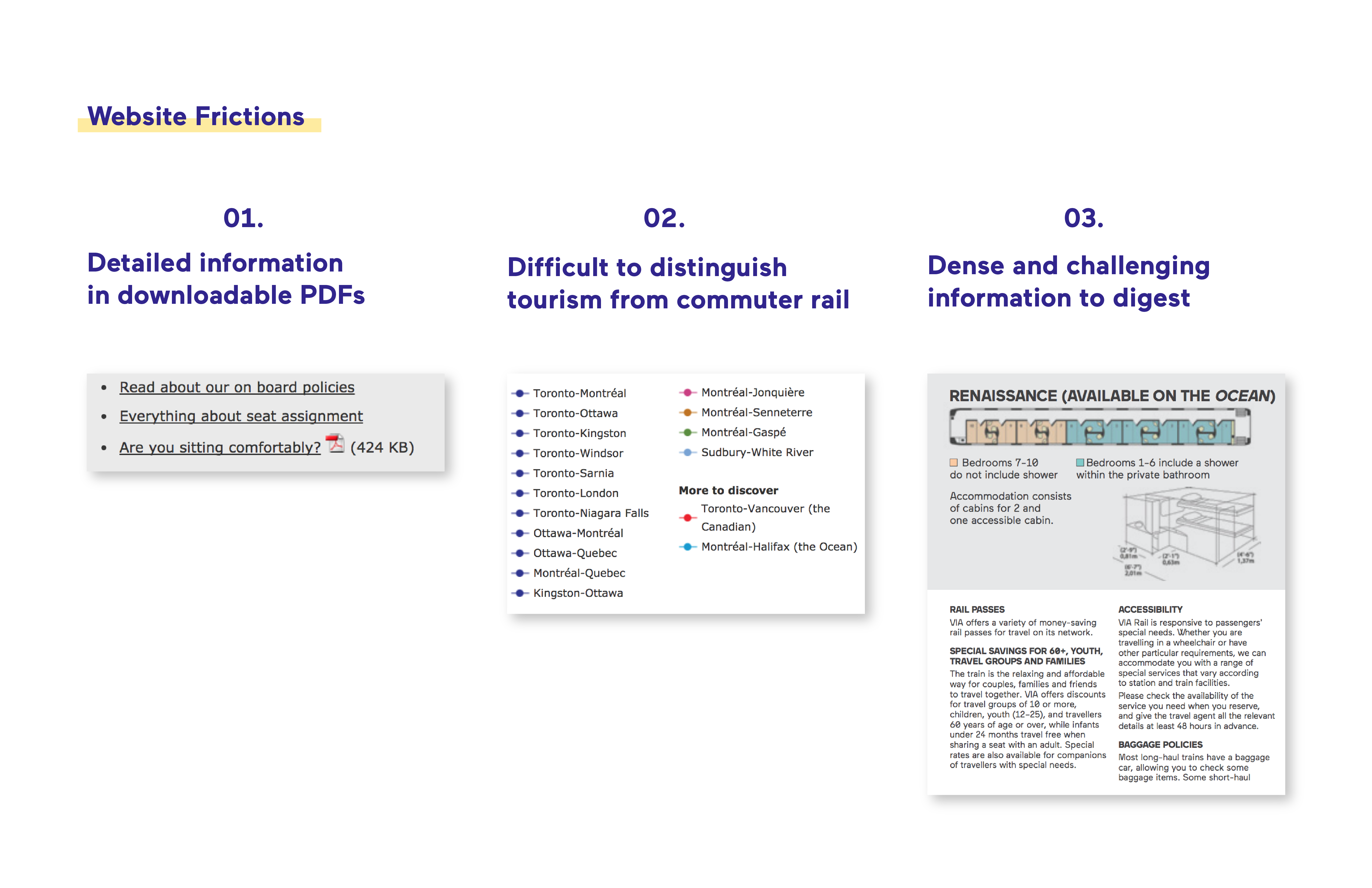
Consumers aren’t realizing VIA Rail’s value proposition due to the current website’s presentation of information: it is difficult to find, digest, and navigate.
We found that the value proposition is better communicated on downloadable PDFs. However, these PDFs contain dense, but useful information that the website does not. Should website visitors not open these PDFs, they would never see the complete value proposition that VIA Rail offers. Should they open these PDFs, the information presented is very dense, diverting people away from accessing this information. Furthermore, it is difficult to distinguish between their long and short-haul services, making it difficult to navigate and see VIA Rail’s differentiator as a provider of long-haul tourism. These friction points create cognitive overhead for consumers, causing VIA Rail to be quickly judged as a pricier and slower provider of transportation.
Proposal
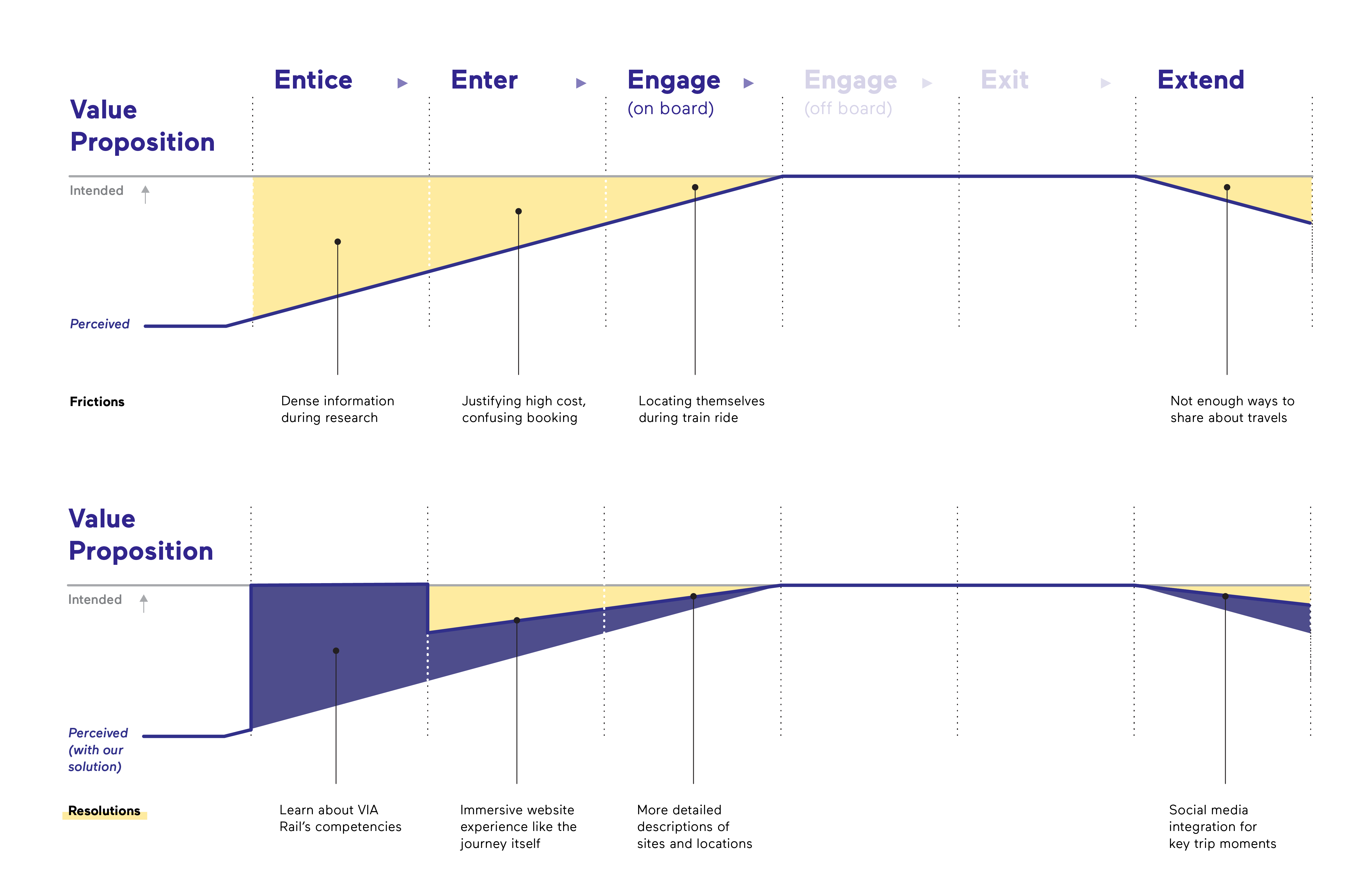
To close the gap between the intended and perceived value proposition, our digital solution, VIA Journey, seeks to highlight the tangible, intangible, and aspirational values being promised and connect potential passengers with a journey that is as valuable as the destination, such that VIA Rail will be considered a desirable option for tourism.
Proposed Solution

Why Website?
We selected a website as the best medium for our intervention as it offers the greatest accessibility to information at any time, compared to other touchpoints we have considered within the entice stage, such as a travel agent or at the station.
Design Decisions
During our design sprints, we explored how might we demonstrate the idea of the journey being as valuable as the destination. We experimented with transformational metaphor of “seeing through a window” for our designs. This manifests in our website’s figurative windows, using full-width media panels to captivate audiences with words alone cannot express.
I also studied precedents for possible interactions. Inspired by National Geographic, we mapped the physical interaction of scrolling to digital navigation. This matched our intent of a guided journey, allowing consumers to peruse content at their own pace, frame-by-frame, appealing to each level of value. This reflects the journey experience in how sights unfold along the way as you progress.
The Prototype
Landing Page
Consumers enter our website through the navigation on VIA Rail’s main website. Then, an optional video of the onboard experience would lead to an overview of the 6 routes VIA Rail offers, presenting an immediate value proposition.
We give an option to skip video at the beginning, considering that the revisiting users may want to land straight on the website. We present the 6 routes offers by listing them as side navigation, so users can clearly pick their options. Once they choose their routes, user can look into details by clicking the explore button.
Journey Page
Moving into a specific route from the homepage, consumers are presented with specific scenes from that journey. Each scene is revealed through the customer’s every scroll, breaking down the physical journey into a series of digital interactions. Combined with animations, VIA Journey creates layers of information, reducing cognitive overhead and affording customers the ability to understand the journey at their own pace.
The intended effect this has on VIA Rail’s perceived value is that the presented landscapes and cities become a tangible value; a promise of what customers will receive, with stories and images to reinforce that journey is the key value of the trip.
Social Media
For each stop along the journey, consumers may notice a subtle pull-out indicator on the right side of the page. Selecting this triggers a playful animation, sliding out a curated series of Instagram photos posted at that stop.
These posts provide credibility to VIA Rail; showing that other passengers have bought into VIA Rail’s journey-based experience. Using geo-hashtags to chunk this content further reduces cognitive effort, and highlights the intangible value promised, to show potential passengers what they might do on this journey.
Class Offering
Scrolling down, the site front-loads our three class options. Hovering over each reveals an immediate tangible value, and clicking explore triggers more information to fill the frame, consistent with the thematic use of the long scroll.
We recognize that we can’t design one set of higher values to appeal to all customers, and we leveraged their price points and distinct classes to better target different types of customers. Instead of trying to appeal to the cost-conscious consumer with the premium offerings, we guide customers down their corresponding classes, tailoring the activities and accommodations that best fulfills their intangible and aspirational needs.
Summary
Finally, after exploring the breadth of information available for the selected route, we wanted to propose the next steps: options for the consumer to book a journey or explore other routes. The intention of this is to provide both a hard and soft commitment; consumers can choose to make the purchasing decision, or continue exploring.
Reflection
What I found to be the most delightful takeaway for myself was being design-driven through using metaphors. When our team came up with the concept of “the journey being as valuable as the destination”, it changed my view of what a project is: the project is not just a means to create value and fulfill needs, it can have a joyful and memorable character. The uniqueness of the project kept my enthusiasm high and motivated me to find ways to drive the concept home, which I believe came across in the final product. Even well after working on this project, the window metaphor and the micro-interactions used to demonstrate this concept excites me and hopefully would excite website visitors as well. I seek to bring this design-driven approach in future projects.
What I would improve on this project is communicating the experience within the train, as being in the train is very much part of the journey. Our team provided interior images and brief descriptions of what is offered onboard but it is not enough to reveal the romance of old-fashion train travel: the immersive feeling of being surrounded by country and mountainside, the train’s rhythmic rumbling in the background, and unique to VIA Rail, the live music to accompany it all. Incorporating this into our final product would give trains a desirable appeal that no other form of transportation can provide.
