
Knack Academics
Web Design + Development Freelancer
Knack Academics (also referred to as Knack) is a tutoring service in West Vancouver that provides academic support for up to 400 students, ranging from elementary to post-secondary school students.
As a freelancer for Knack, my role was to address concerns with the old website to better streamline their branding, as well as improve usability and the information architecture. I redesigned and developed a new website in 5 days.
Type
Freelance
Role
Wireframing, Web design, Front-end development
Tools
HTML/CSS, Bootstrap, Illustrator, Photoshop
Duration
5 days
Setting the Mood
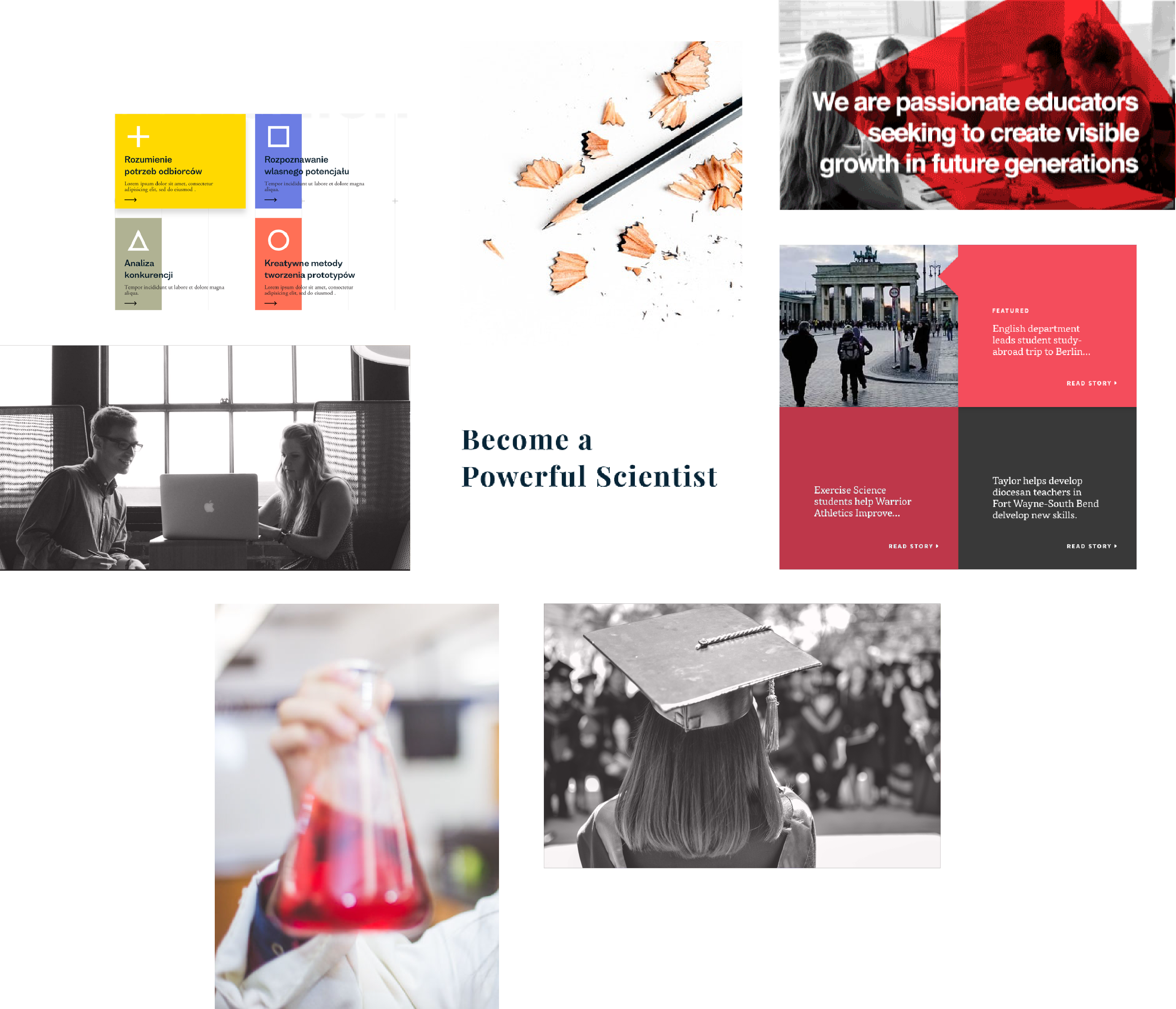
After the first consultation meeting with the founder, Nicholas Cragg, to understand his vision for the new website, I created a three moodboards showing potential visual directions for the website. What came out of the second meeting was tidbits from each moodboard, which included the use of blocks that echoes Knack’s existing logo; the Knack red as the primary colour but also using other colours to differentiate courses; aspirational photos of individuals to convey empowerment, success, and goal-orientation; as well as photos of students and objects that communicate a university feel. Lastly, to support the copywriter, the visual identity would be accompanied with the use of aspirational language that incite action, for example “Become a Powerful Scientist”.
The Website
The homepage
The main concern expressed about the old homepage was that it was missing a space for announcements and testimonials, the latter was hidden as a link in the footer. As well, what I observed was the absence of Knack’s tagline. Furthermore, there was the overuse of buttons in one area of the homepage and no context as to what a visitor may expect to see unless they clicked on it.
For the redesign, to address the main requests, I included an announcement bar right after the hero banner as it is a place that deserves greater hierarchy for holding important information for parents and students. As well, the testimonial section is housed near the bottom of the page to reinforce the value of Knack’s service after getting an understanding of it from reading the above.
Following the main requests, I used the hero banner as a space to draw emphasis on their tagline, “Discover Your Great Mind”. In the “Knack Academics” section, I incorporated sliding animations that reveal images as you scroll to this section to bring emphasis to the tagline – the idea of discovery. In the next section “How We Help”, I used large, clickable blocks to move away from the usual button form, with each block reflecting a similar style as seen in Knack’s posters. As well, each block contains content as an opportunity for Knack to communicate its value proposition. The last big redesign piece is the call-to-action to book at the bottom of the page. This is intended as a place for parents or students to get started after digesting the above, as well to maximize ease of booking without scrolling to the top again.
Original
New
Services
The previous services page had each service on a new page, however each service contained just a short paragraph of content. In the redesign, I placed all services on one page but included a fixed, scrollspy navigation on the left to help guide a visitor through the content of the page.
Original
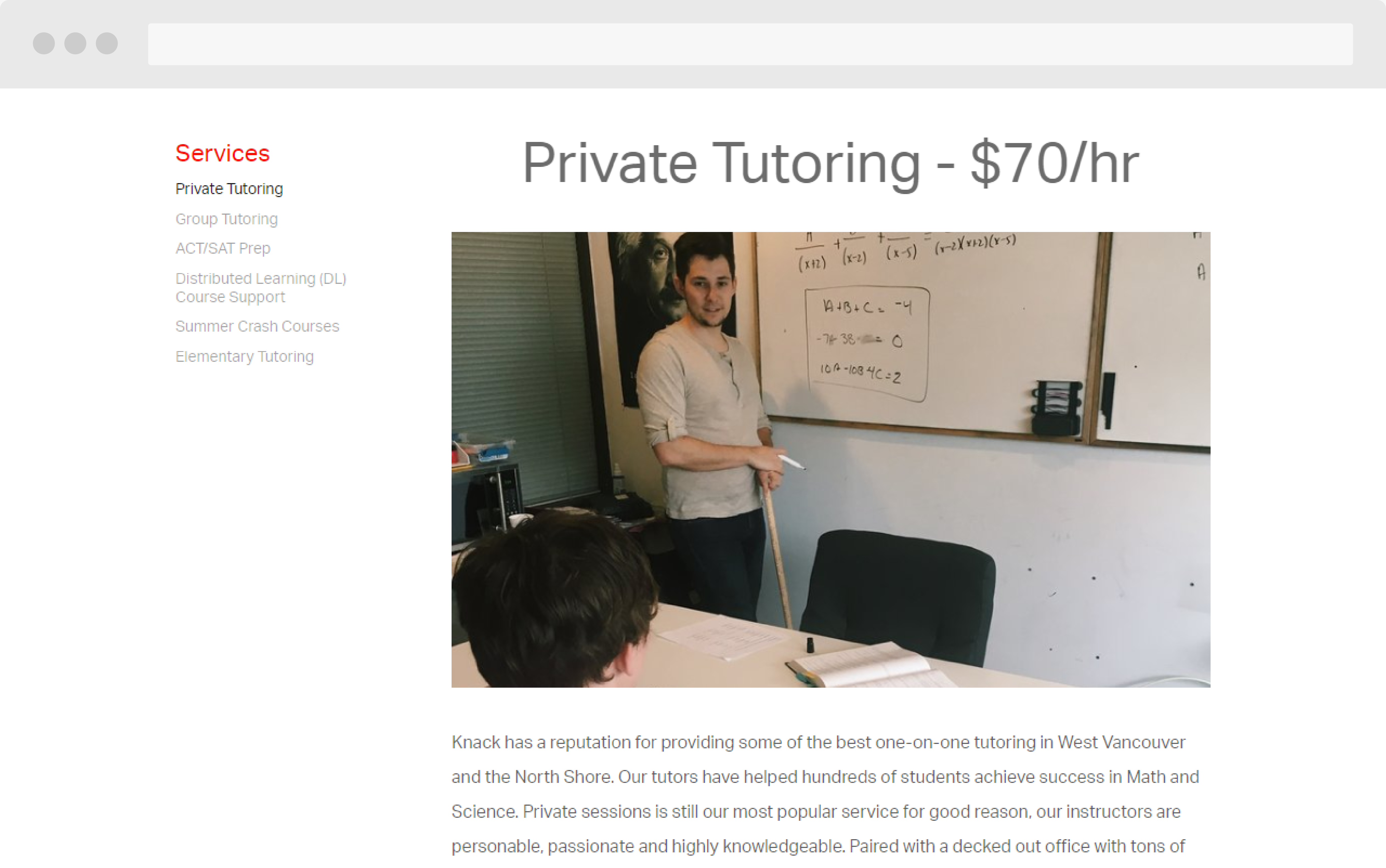
New
Team
The previous team page held a dense amount of information that created a long page for scrolling. To reduce the amount of content of the page but still making it accessible, I kept key information visible which includes teacher availability and subjects taught. Reducing the information to these key points affords the ability for a visitor to easily compare teachers at a glance. To access the bios, hovering over the image causes an overlay with a magnifying glass icon to appear, suggesting interactivity. Clicking on the image will then reveal a teacher’s bio. With the absence of touch interaction on mobile, the overlay will appear as you scroll.
Original
New
Student Resources
With Student Resources, also known as Knack Club, it had a very different look and feel that felt detached from the old website. For the redesign, I had to work within the constraint of a specific structure that Nicholas had envisioned. Specifically, for the Knack Club landing page, the subject should be laid out more prominently rather than within the navigation as previously done. As well, from clicking a subject, it would allow a visitor to access a course’s unit directly, whereas before, it required clicking on a subject, then course, then unit. Furthermore, within a unit, there would be a 3-column structure for notes, homework, and, a new addition, videos. As before, I used different color for each course for better visual distinction.
Original
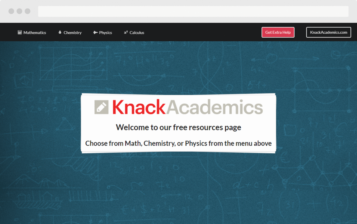
New
Reflection
Freelancing for Knack Academics was a great learning experience not in the execution of the work, but more so in communication in meetings. From prior experience, clients trust that the functionality will run smoothly and much of the meetings revolved around design. In contrast, this was the first time working with a client where they trusted the moodboard, the wireframes, and subsequent design decisions. A large part of the discussion was around functionality, such as having the new website be compatible with videos and the existing booking software, as well as improving how the navigational button would interact. Bringing in expectations of how meetings ran before made me realize that my priorities and Knack’s priorities were not aligned. As a freelancer, it’s my responsibility that a client feels at ease at every step of the way. Moving forward, I learned that I need to lay out the scope of the discussion from the beginning and, given more time, make prototypes a priority in my process.