Toyota
Mobile App
Toyota Guardian is an application that looks out for drivers throughout their ownership experience. Our goal with Toyota Guardian was to create a transparent and trusting relationship between driver and Toyota’s technology today to ease people to trust self-driving cars in the future, as well as to build a more receptive market for Toyota and their future products.
Our team was given the opportunity to be mentored by Chelsea Garber, the Product Design Lead from Inamoto & Co. for this project. Out of the total 8 teams, two teams whose projects that were selected by Chelsea, our VIA Journey project being one of them, worked with Chelsea on one of their client briefs. We selected Toyota and was tasked with considering, “How might we ease people into trusting self-driving cars?”
My role in this project was mainly focused on market research and analysis, user research, ideation on the project’s form and features, as well as content strategy and writing for our project proposal, prototype copy, presentation slides, presentation script, and video. I also held smaller roles in graphic design for our presentation slides in an early week of research and ideation.
Team
Joshua Fan, Michelle Ng, Gabriel Yeung, Grant Zou
Type
Academic
Role
UX, Market research, Ideation, Content writing and strategy
Tools
Illustrator, Photoshop, After Effects, Premiere Pro, Keynote
Duration
5 weeks
Deliverables
SlidesProcess
Business Problem
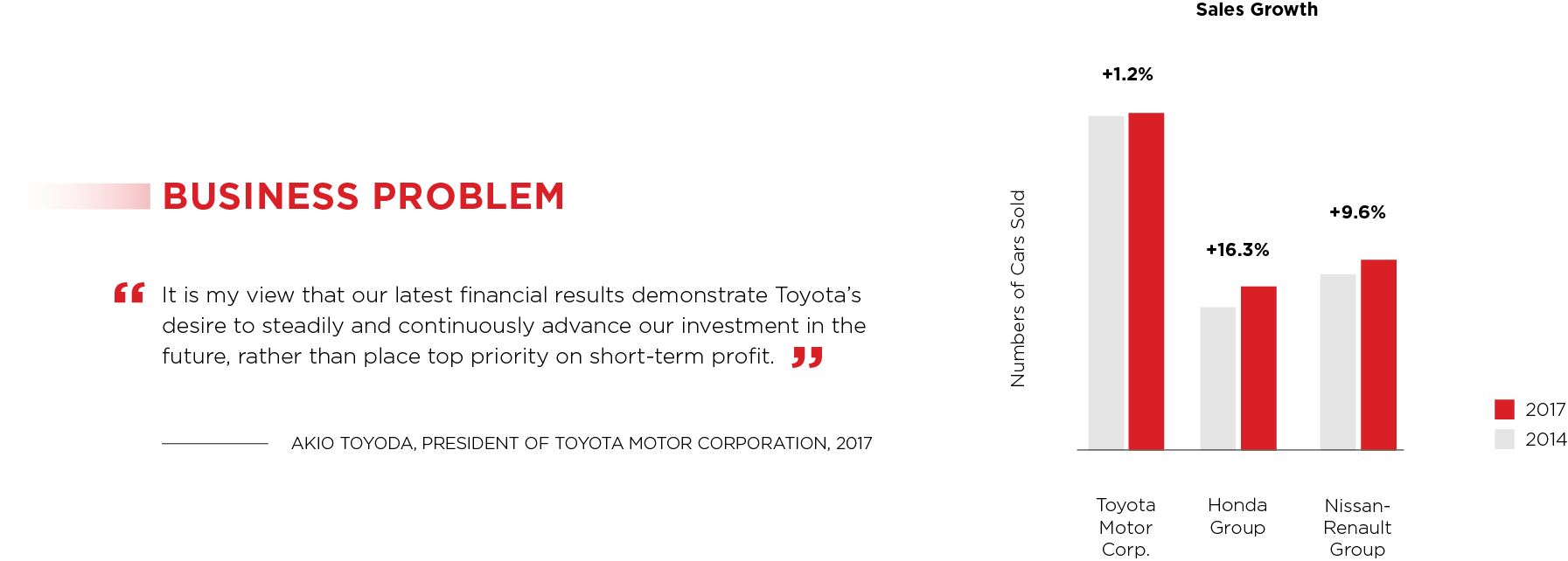
Looking at the long-term business problem, even with Toyota’s excellent safety record and the potential safety gains autonomous vehicles have to offer, Toyota is aware that society will remain resistant to the social and economical implications of this emerging technology.
Upon further investigation, Toyota also faces a short-term business problem. Despite maintaining nearly double the sales volume of its competitors, as of 2017, Toyota’s sales have been in the midst of a 4-year stagnation, and competitors are beginning to close the sales gap. Toyota’s investment in the future has a long-term pay off, and until their unique approach to autonomous vehicles hit the market in 2021, Toyota expects no significant change in their financial condition
Our challenge, then, is to instill consumer trust in self-driving cars, as well as to increase the value proposition that Toyota has to offer to differentiate themselves in the market and improve their financial condition.
The Brand
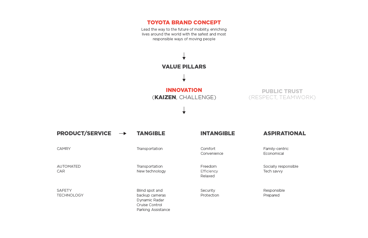
Using the Brand Value Pillars Framework from Newbery and Farnham’s Experience Design book, we identified Toyota’s brand concept and the value pillar that best supports the brand concept and that we, as designers, can control. Working with brand value of Kaizen, meaning continuous improvement, I pinpointed the products and services that are tied to it and determine the tangible, intangible, and aspirational values delivered. From this analysis and other research, we learned that Toyota’s current vehicles share a lot of the same sensor technology as their proposed autonomous vehicles, minus taking control over the vehicle. Iterating on safety technology today in their future autonomous cars is a testament of their brand value of Kaizen. However, as their current safety technology is not always immediately perceived as a safety feature, such as parking assistance, and with some only activated in times of emergencies, Toyota’s brand differentiator of safety and reliability isn’t connecting with owners.
MAYA Principle
While we researched psychological and social topics to uncover why people may fear self-driving cars, such as the Social Contract theory and the over-trusting paradox, we recognized that these concepts are too broad and difficult to tackle with none of us having a background in these fields. However, we realized early on in our research that we needed to scale down this project to make a measure impact to Toyota and provide a feasible foundation for our Design Sprints.
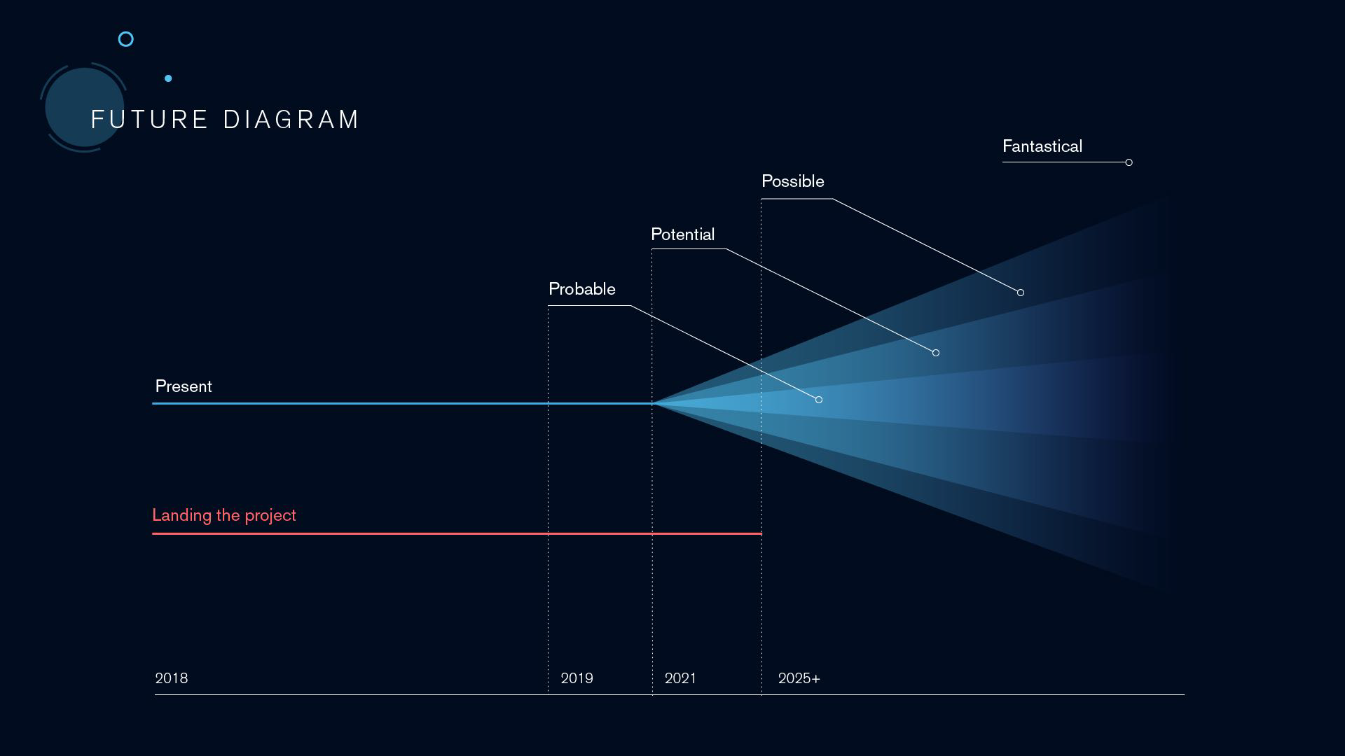
With our task of scoping down our project to suggest something about the future resonated with the MAYA, or Most Advanced Yet Acceptable, Principle – that is, to design for the future yet delivering it gradually. To deliver a proposal that is believable and probable, we needed to ground our project in the present first before dabbling in the possible and even fantastical.
The Opportunity
With Kaizen and the MAYA principle in mind to drive our project direction, we saw an opportunity to improve Toyota’s value proposition of safety, beginning from their current products then iteratively extending to their future concept products to provide a tangible, immediate preview of tomorrow.
Customer Segment
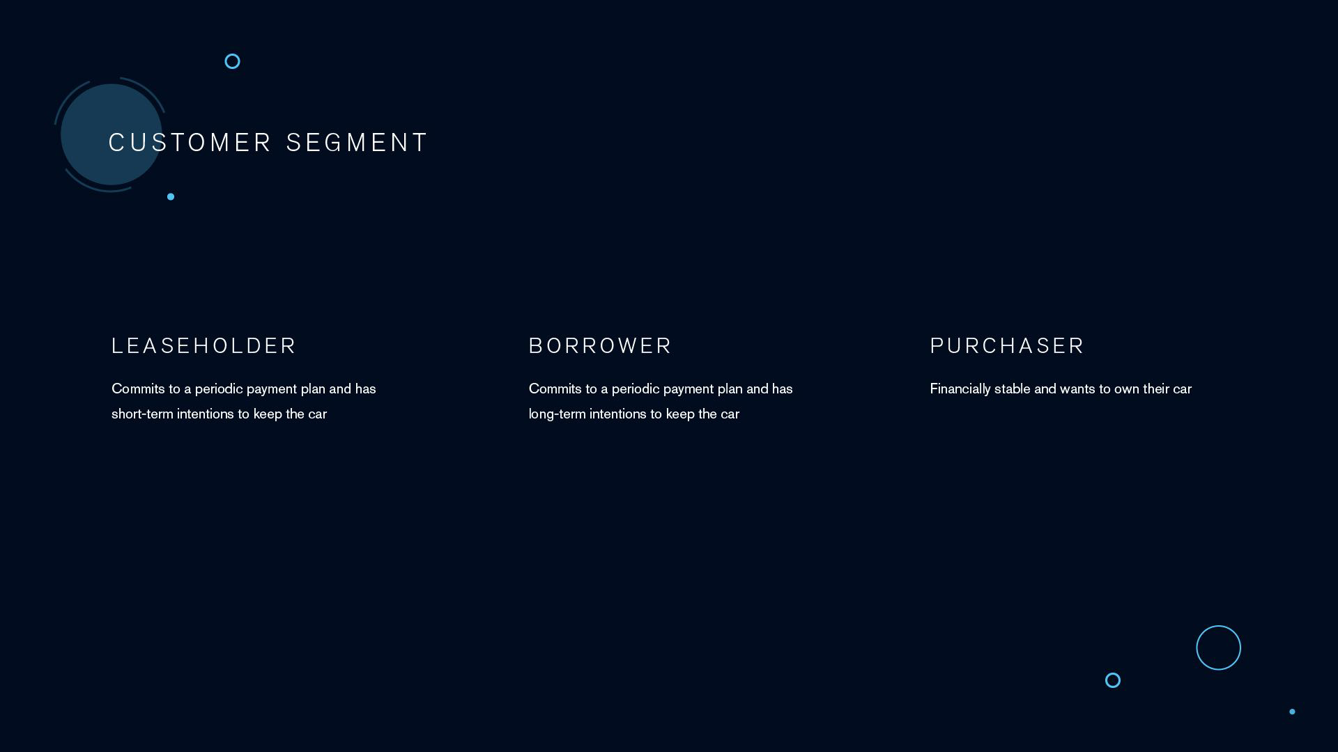
To help narrow our focus, we discovered that Toyota’s lease-based business model accounts for 31% of all new car purchases being leased on 3-5 year terms. This means they guarantee return visits when returning their vehicles and, in many cases, more frequent return trips for maintenance. We therefore chose to focus on leaseholders as these return visits throughout the different stages of vehicle ownership provides multiple points of introduction and ensures existing leaseholders are not excluded. Moreover, by easing leaseholders into trusting Toyota’s technology today, they are more likely to be receptive to purchase autonomous vehicles when it goes to market.
Persona
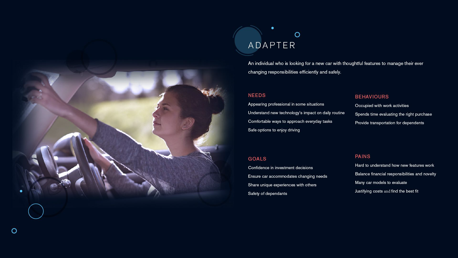
We then developed a persona who is described as a young adapter. An adapter is fitting as they likely to be more responsive to owning newer vehicles on the market. Moreover, with a young adult demographic, they have a preference for subscription-based services because they offer lower up-front costs – leases are among one of them.
The Customer Journey
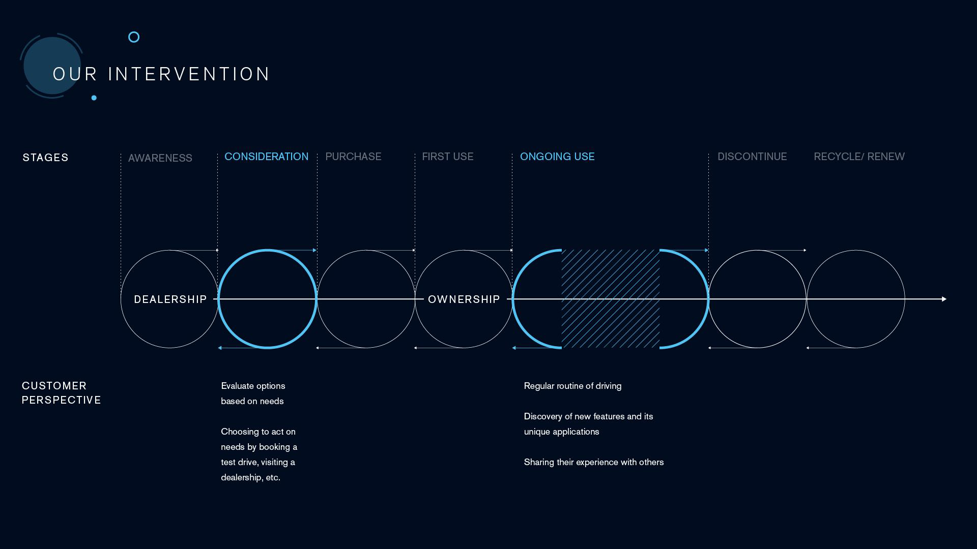
Having this persona in mind, we recognize that our customer journey can take place over multiple years with two main stages: consideration and ongoing use. We chose to intervene in the ongoing use stage where the customer is living with the vehicle. This is where our digital solution can demonstrate Toyota’s value proposition of safety with the benefit of time and variation in driving conditions.
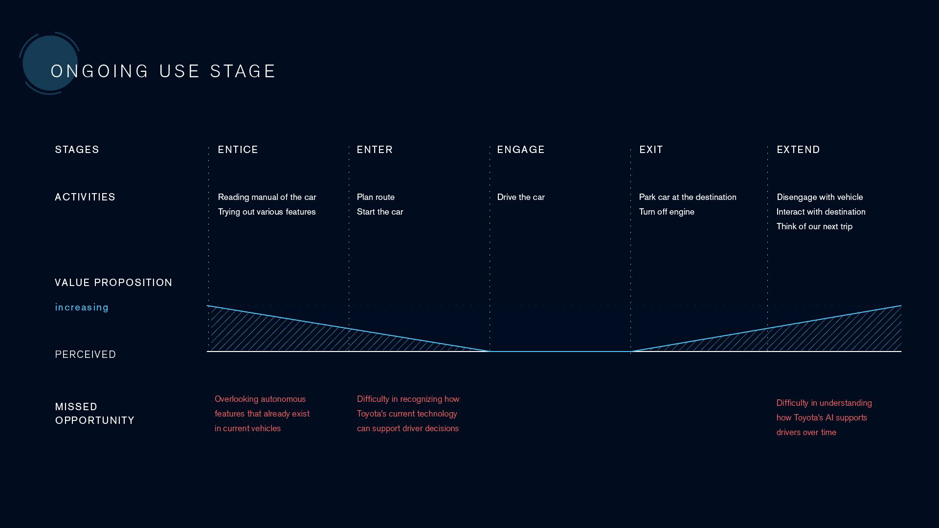
We broke down the ongoing use stage further to identify any missed opportunities that our digital solution needed to address. We use the term, ‘missed opportunities’ instead of ‘frictions’ as we are anticipating increases in perceived value that is forgone if our digital solution did not exist. Finding frictions within this stage falls outside our analysis as there is great variation in the ongoing living experience and the car itself which are difficult to account for. To summarize our findings, we expect that a digital solution would use most useful just before and after the drive, and not during the drive itself as it is important to be fully engaged with the car.
Missed Opportunities
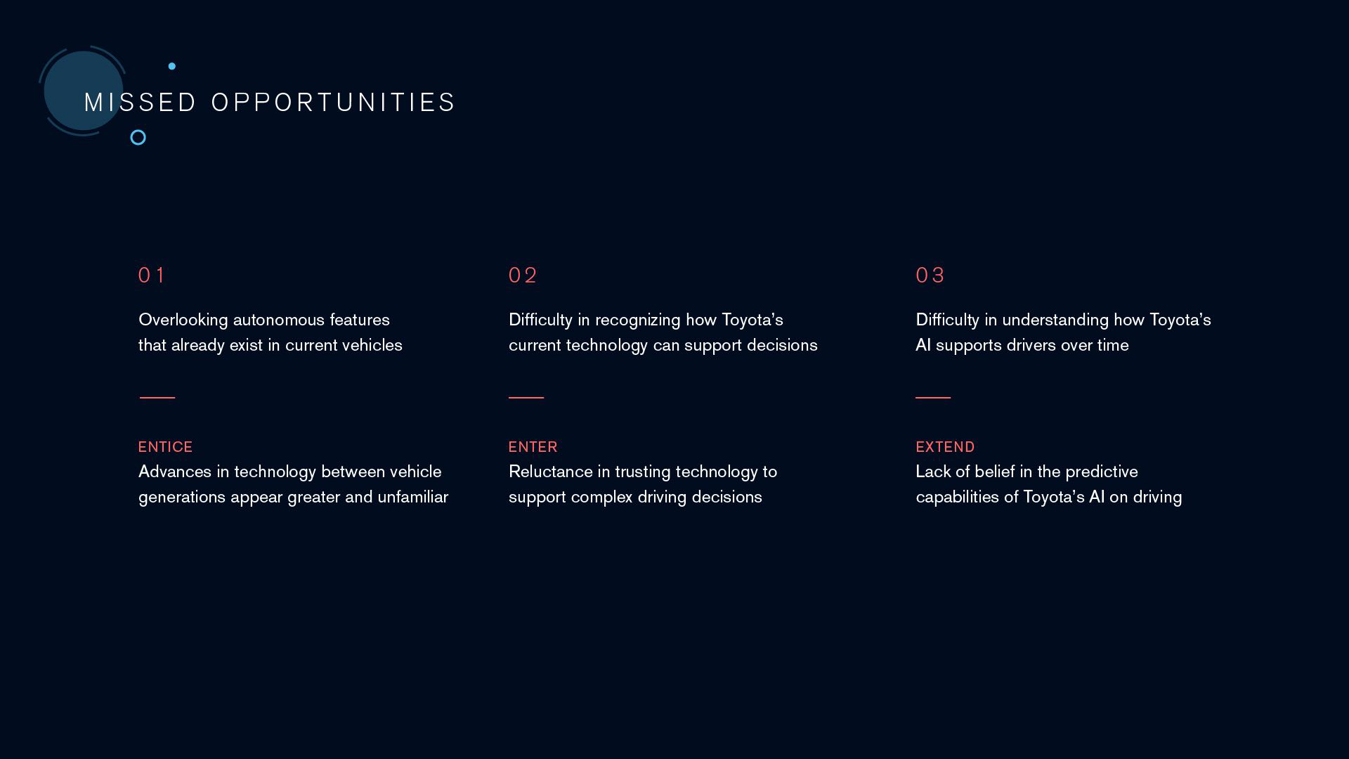
We identified three missed opportunities. Within the entice stage and learning from our earlier research, certain autonomous features in existing vehicles can go unrecognized. By making Toyota’s safety technology more apparent, drivers will come to recognize Toyota’s differentiation. Within the enter stage, there can be difficulty in recognizing how Toyota’s safety technology can inform driving decisions. We see that if the technology can help support complex driving decisions, it can ease people into trusting it. Lastly, within extend, there can be difficulty in understanding how Toyota’s safety technology supports drivers over time, such as habitual driving patterns. If Toyota’s technology can make difference in daily routines, it can further ease people to trust AI’s predictive capabilities. All these contribute to the owner’s cognitive overhead, that the potential of autonomous technology to enhance the driver’s experience is not immediately understood or trusted.
Proposal
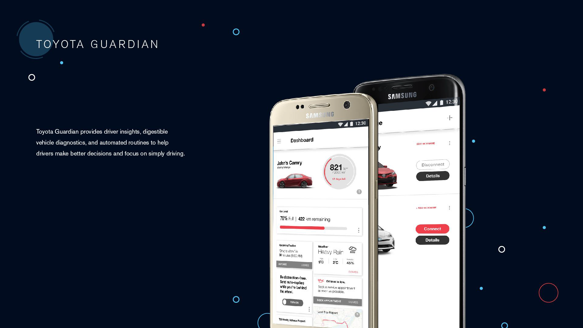
To address these missed opportunities, our digital solution, Toyota Guardian, seeks to make Toyota’s safety capabilities more understandable, as well as to reinforce a sense of security by “looking out for drivers” in the decisions they make and the driving behaviours they have. By creating transparent and meaningful relationship with the driver, we aim to build customer understanding and trust in Toyota’s technology today and in the future, which in turn helps to better differentiate Toyota and their commitment to safety.
Proposed Solution
Why App?
We choose a mobile app as the best medium for our digital solution as it provides immediate notifications as needed prior and just after driving through personal on-the-go access.
Design Decisions
From our design sprints, we explored how we could demonstrate the “Guardian” concept. We recognize that showing how Toyota’s safety features “think”, such as detecting dangerous drivers, goes beyond the designer and into the world of engineering, making our app difficult to believe for the common driver. Moreover, certain safety features are absent in some cars, which would exclude users, especially those with older vehicles, from using our app. Considering this, we challenged ourselves to think about how we could make AI within these safety features more understandable and imply that it is looking out for the driver. We thought of two ways: the first being to provide driver insights to inform better driving decisions, and the second being to learn about driving behavior and offer suggestions.
Furthermore, as new technology is often difficult to understand and requires learning, we needed to humanize data. This meant converting data into digestible information using easy to understand language.
The Prototype
Onboarding
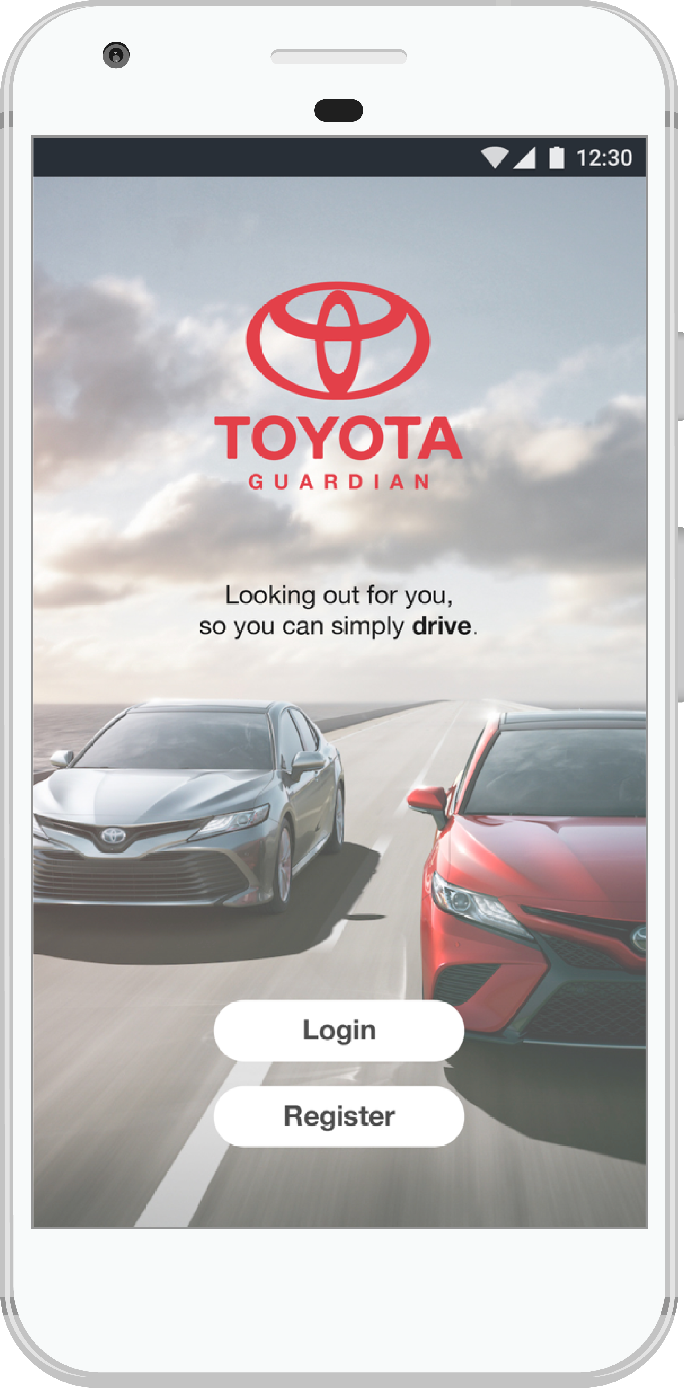
Upon opening the app, owners are prompted to log in, with a conversational introduction to the value proposition that Toyota Guardian is offering – that is, it is “looking out for you”.
The Garage
After registering an account and connecting their vehicles, owners can visit the Garage, showing all vehicles and basic details of each car. When needed, owners also have the option of adding additional vehicles.
The Dashboard
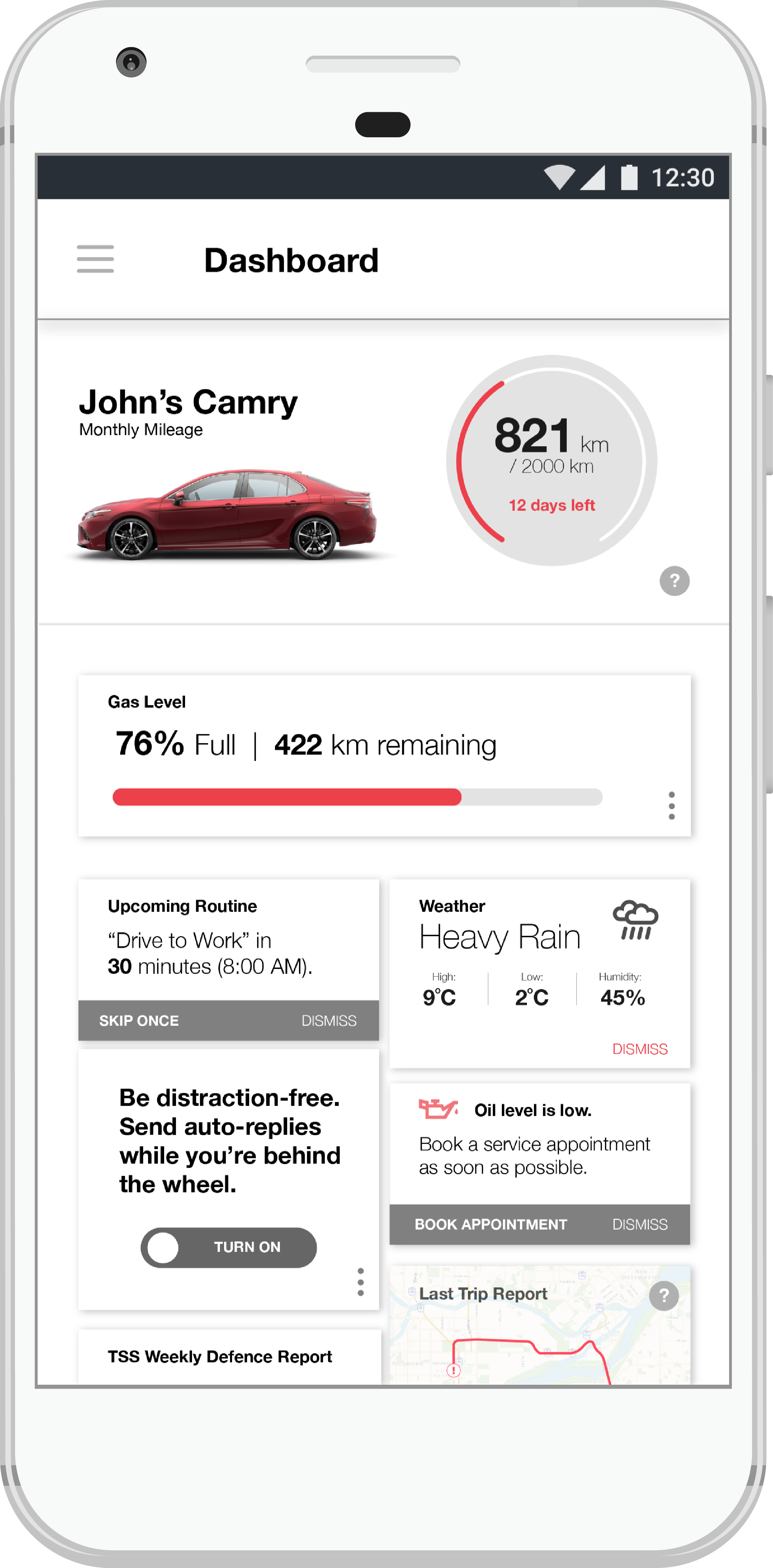
Owners are provided snapshots of their vehicle in easy to understand language, providing a match between the system and the real world. From mileage and fuel consumption to weather and road conditions, information here is intended to help the driver make key decisions.
Activity
Between trips, Toyota Guardian provides a drivers’ log of events, showing trip details such as destination and fuel consumption. In highlights, any notable events that trigger Toyota’s safety sensors are featured, with an incident report being generated as well as related dash cam footage provided. Here, the Activity page holds information about the drive itself to inform safer and smarter driver decisions.
Routines
With routines, we wanted to highlight the benefits of automation and predictive artificial intelligence. If Toyota Guardian recognizes repeat behavior of the driver, such as regular drives to home and work, it will suggest automating certain aspects of the vehicle, minimizing the user’s memory load through recognition rather than recall. Users can also create their own routines.
Notifications
Notifications are also used to reinforce the value of automation and AI’s predictive capabilities, looking out for drivers even when they are not actively using the app. Notifications provide suggestions from Toyota Guardian’s AI, such as an automating an upcoming work trip or reminding the user post-drive that a hazard happened along their route.
The Speculative Solution
We considered how Toyota Guardian could iterate and evolve when autonomous cars do come into the market. From our research, Toyota has expressed interest in blockchain smart contracts that would allow Toyota owners to rent out their vehicle’s unused time to earn money. Moreover, we know that younger leaseholders are motivated to lease because of lower upfront costs and preference for subscription-based services.
We therefore saw an opportunity to evolve our Toyota Guardian app to connect Toyota’s interest in smart contracts with cost-conscious leaseholders by enabling car sharing services. It offers value for owners in that they can earn money, while for Toyota, it helps them collect car data to advance their AI developments.
Reflection
Toyota Guardian was a challenging project because it involved designing for a product that is not widely available on the market and addressing a subjective feeling of fear. Prior to grounding our project, we had strong hesitations about the project direction which was apparent from the way we made a number of hard pivots. The first was moving away from psychological and sociological reasons for fearing autonomous technology. We also let go of an earlier proposal of a tablet app for a dealership salesman to demonstrate Toyota’s safety technology, realizing that the distrustful reputation of salesman may cause customers to also be wary of the app. From this experience, it has made me more comfortable with the possibility of restarting and that I do not need be multidisciplinary to solve a design problem. Though It certainly helps!
What would I improve on this project is creating a two-way relationship between the app and user. Currently our digital solution is a one-way exchange in that the app is giving information to the user to make better driving decisions. However, this can create cognitive overhead as the app creates work for the user to interpret this information according to their driving patterns. A two-way relationship would allow a user to give input and retrieve the information they want. For example, a user may want to know if they can make it home with a 30% gas level. Creating a two-way relationship would build more driver trust from the greater level of personalization versus an app that could tell any driver that they have a 30% gas level.
